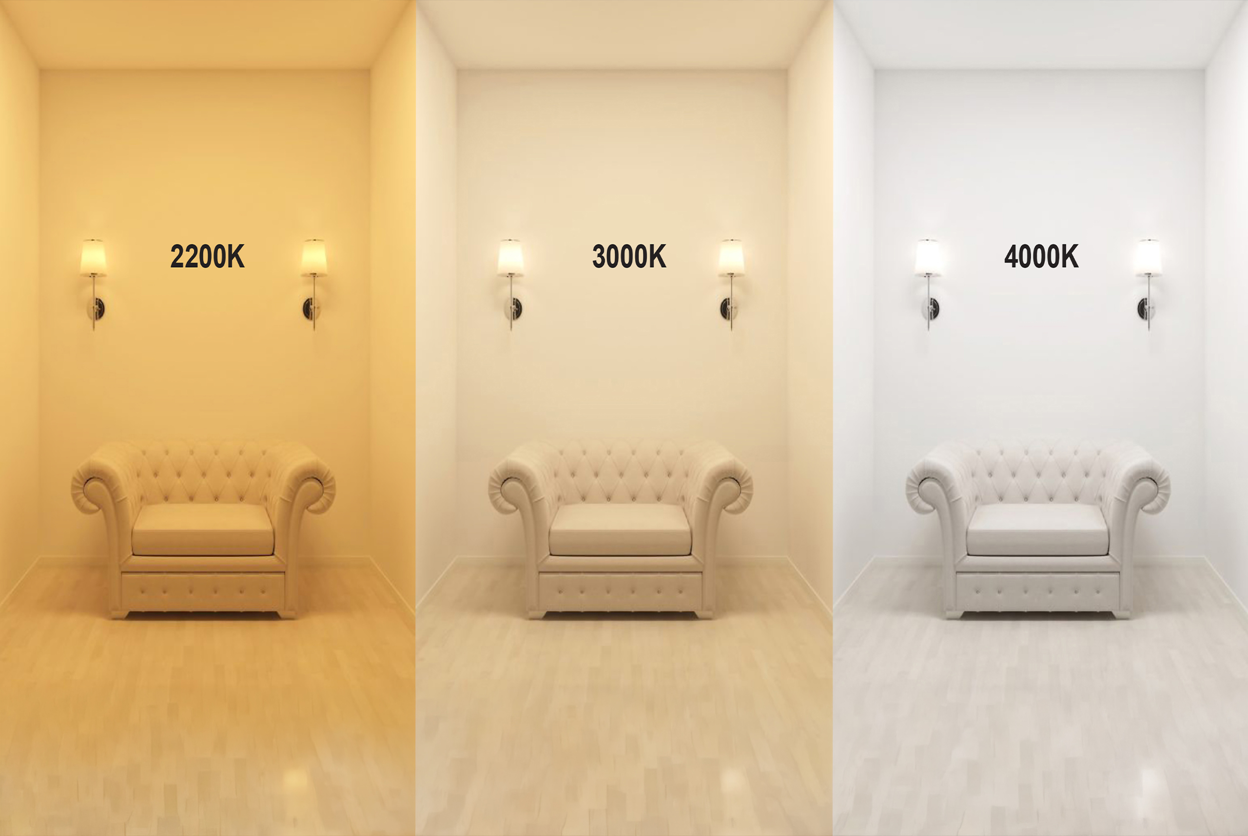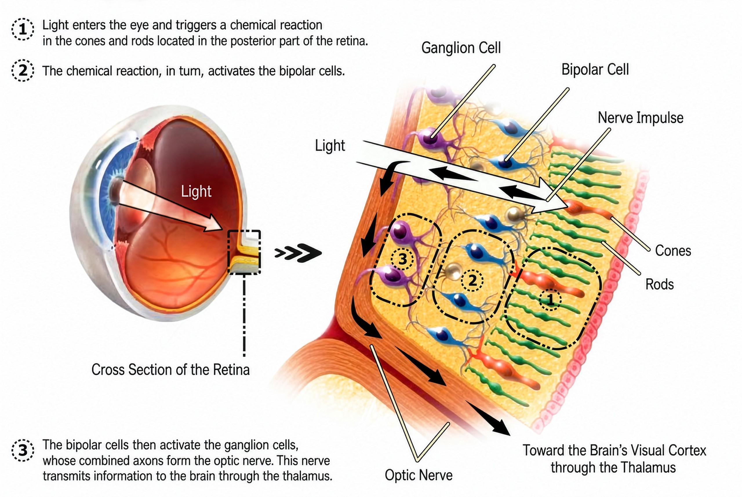
Now that we have understood how the spectral distribution of light influences the color rendering, visual perception and biological effects of light radiation, it is necessary to introduce a fundamental tool to represent and quantify the color of light: the chromaticity diagram. To fully understand the color perception in lighting design, it is of fundamental importance to start from the CIE 1931 chromaticity diagram, which represents in two-dimensional form the entire range of colors perceptible by the human eye. This diagram not only allows us to visualize the chromatic position of light sources, but also constitutes the theoretical basis for expressing crucial concepts such as color temperature and the CCT (Correlated Color Temperature).
In the diagram, each point corresponds to a specific shade of light, encoded via the coordinates (x, y) derived from the spectral sensitivity curves of the three theoretical photoreceptors (XYZ tristimulus). Within the figure, a curve called black body locus (black-body locus) shows the trajectory of the colors emitted by an ideal black body heated to different temperatures. This plot is the reference for determining the absolute color temperature, expressed in Kelvin (K).
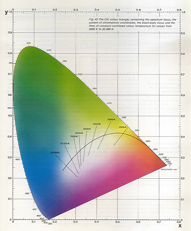
The color temperature it therefore defines the colour of the light emitted by a source compared to that of a perfect black body at the same temperature. When the emitted light does not coincide exactly with that of a black body – as happens in most LED or fluorescent sources – the concept of correlated color temperature (CCT), which corresponds to the temperature of the black body whose emission is closer (in terms of color perception) to the analyzed source.
In the diagram, the distance from the blackbody curve represents the chromatic deviation the shorter the distance, the more neutral and natural the light will be. Conversely, sources that are distant from the locus (especially towards the greenish or purplish regions) can generate altered or less comfortable visual perceptions.
Another essential principle that the diagram illustrates is that of additive mixing of colors by drawing a line between two color points, all the colors along that line can be obtained by combining the two sources at the ends, with variable proportions. This concept is particularly useful in the design of multichannel LED sources, where white light is obtained by combining multiple diodes of different wavelengths.
In the 1931, when the International Commission on Illumination (CIE) published the famous chromaticity diagram, the panorama of light sources was dominated by incandescent lamps and, increasingly, from discharge lamps the diagram was conceived as a tool to represent the perceived chromaticity of light sources, that is, their color tone as interpreted by the human visual system. This model is based on a mathematical abstraction of the trichromatic vision of the human eye and uses the chromaticity coordinates (x, y) to describe every possible visible color by placing it in a two-dimensional area.

The incandescent lamps and the following ones halogen lamps (1959), based on the thermal incandescence of a metal filament (usually tungsten), emit a continuous spectrum which can be effectively represented in the diagram, since their behavior is similar to that of a black body. In this context, the color temperature has a direct physical meaning, and therefore the use of the black-body locus as a reference for classifying light sources according to their color tone (warm, neutral, cold). The light emitted by these sources is warm, continuous, and has high color fidelity, but their energy efficiency is relatively low.
At the same time, the discharge lamps, come i neon tubes, the mercury vapor lamps (low and high pressure) and those at sodium vapor these sources generate light by passing a current through an ionized gas, emitting a discontinuous spectrum, composed of selective spectral lines. Although the resulting chromaticity can still be traced in the CIE 1931 diagram to obtain a correlated color temperature (CCT), the quality of light— in terms of color rendering— cannot be deduced or faithfully represented with this instrument. In fact, sources with discontinuous spectra can occupy the same chromatic position of continuous spectrum sources, although they differ radically in their ability to reproduce colors.
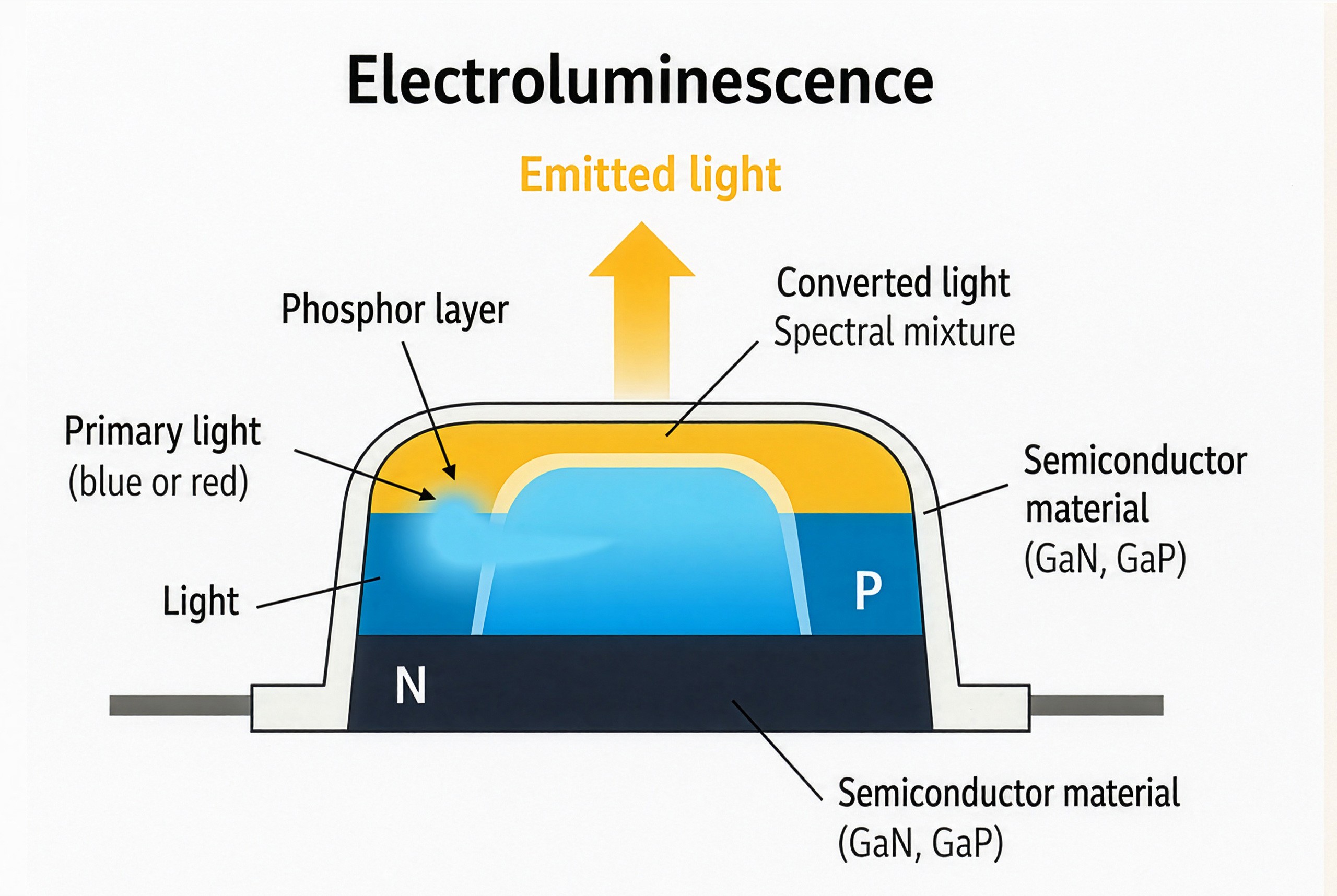
With the advent of the LED, the situation has become further complicated. The light emitted by the diodes does not follow the principle of incandescence, but is based on a process of electroluminescence, in which the spectral composition is determined by the interaction between semiconductor materials (like the gallium nitride or the gallium phosphide and phosphor layers the result is a artificial spectral synthesis, selective and non-thermal, which produces curve SPD (Spectral Power Distribution) heterogeneous, characterized by spectral peaks and gaps, with significant effects on color fidelity, saturation and visual perception.
In this new scenario, the CIE diagram of 1931, although still being formally in force and recognized by organizations such as CIE, ISO and IEC, it turns out conceptually outdated for many practical applications related to LED light. Its perceptual non-uniformity implies that equal distances in the diagram do not correspond to chromatic differences perceived as equivalent, making it inadequate to accurately describe the color quality of composite spectrum sources.
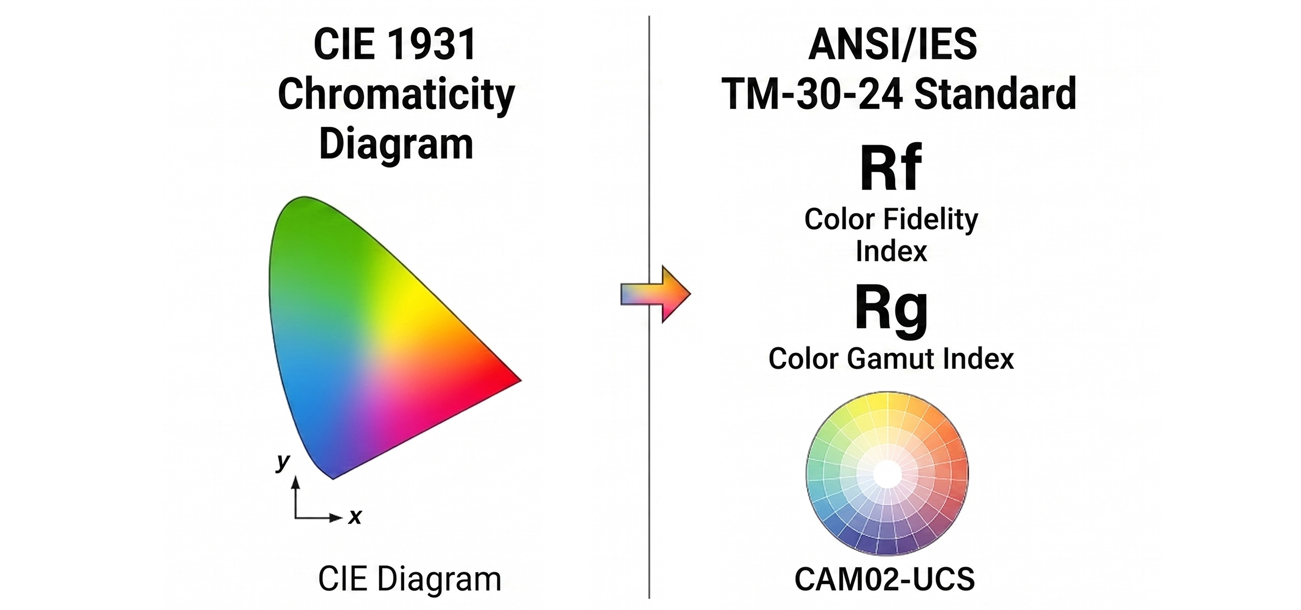
To address these critical issues, the standard ANSI/IES TM‑30‑24, which today represents the most advanced and up-to-date tool for the color rendering analysis this document, published in its latest version in 2024, goes beyond the limitations of the traditional CRI (CIE Ra) introducing a multidimensional evaluation system based on two main metrics: Rf (fidelity index) e Rg (gamut index). The first measures color fidelity compared to an ideal reference, while the second quantifies the range and variation of color saturation. Both are calculated from 99 standard spectral samples and use it CAM02-UCS color space, which ensures greater consistency with human perception.
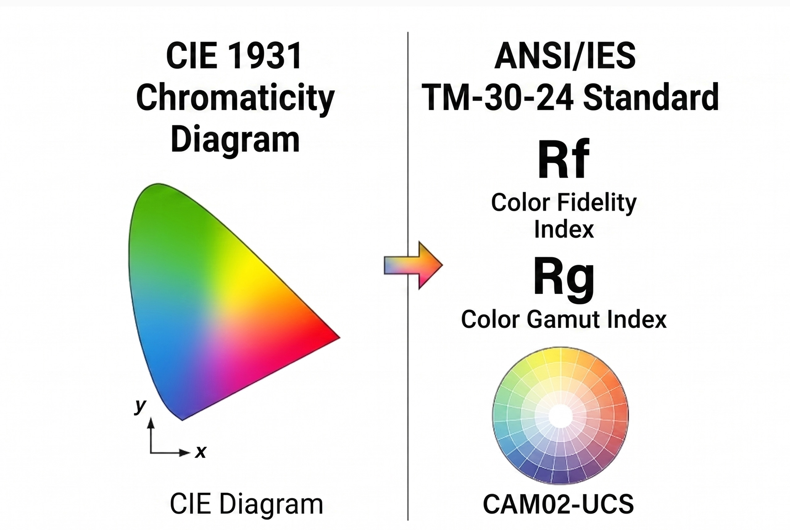
In addition to providing synthetic values (Rf, Rg), the TM‑30‑24 allows detailed analysis via local parameters (R<sub>fhj</sub>, R<sub>cs,hj</sub>) and graphical representations such as the Color Vector Graphic, highlighting the chroma and hue changes for each hue range. Thanks to this analytical granularity, it is possible to precisely evaluate the visual impact of light on objects, surfaces and people, offering designers useful tools for critical applications such as museums, retail environments, hospitals the schools.
In conclusion, the CIE diagram 1931 preserves a normative, historical and didactic value, remaining useful for identifying the basic chromaticity of the sources. However, in the contemporary context, dominated by the proliferation of broad-spectrum LEDs and from an increasing attention to visual comfort, perceptual performance and circadian stimulation, it has become essential to integrate chromatic analyses with more advanced and specific tools, capable of considering not only the position in the color space, but also the spectral composition, the real saturation and the biological implications of light. In light of what has been discussed, it is clear that the evolution of light sources has required more sophisticated metrics compared to classical instruments. The TM‑30‑24 today stands out as technical and regulatory reference for a lighting design based on real spectral data, updated perceptual criteria and measurable color performance.
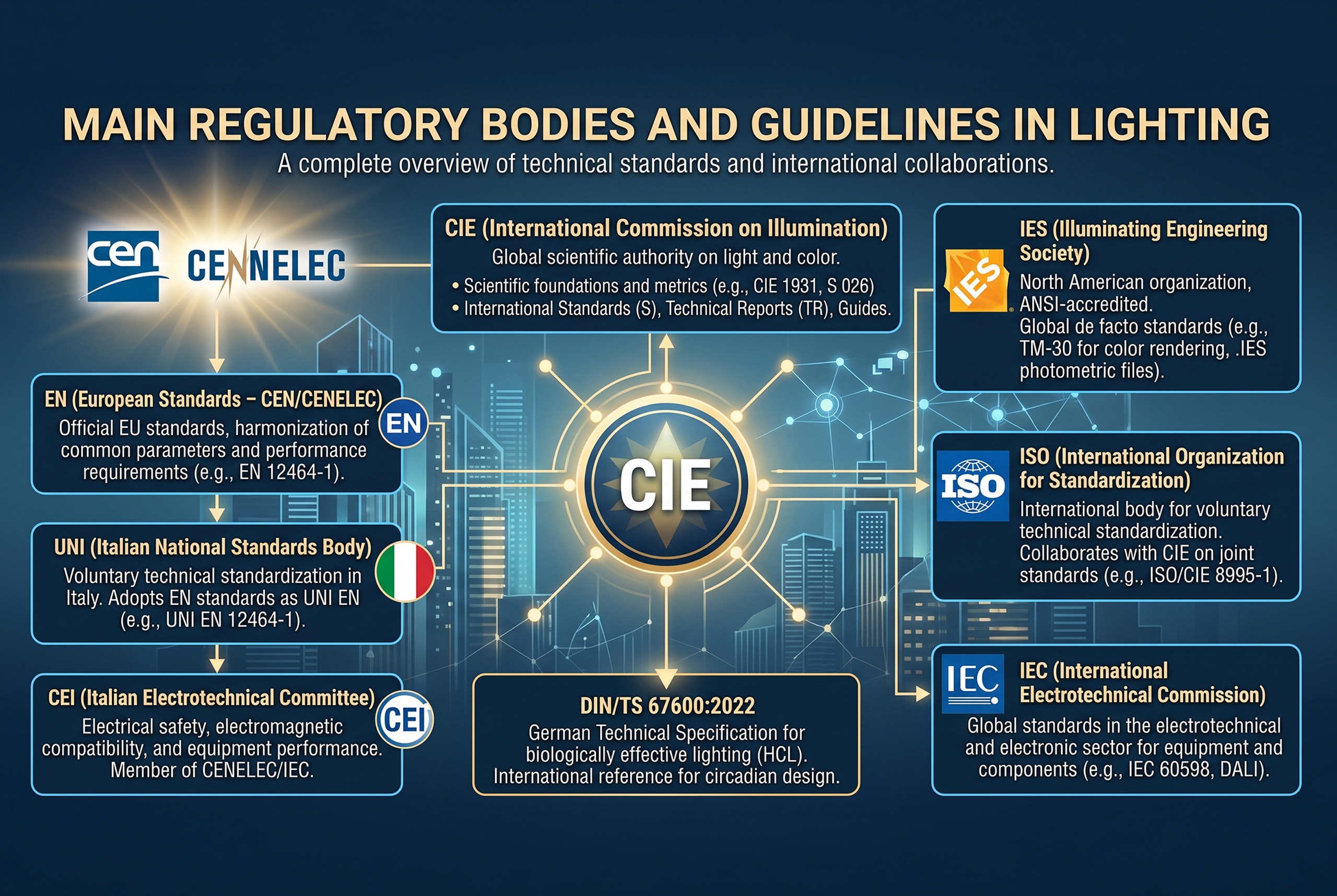
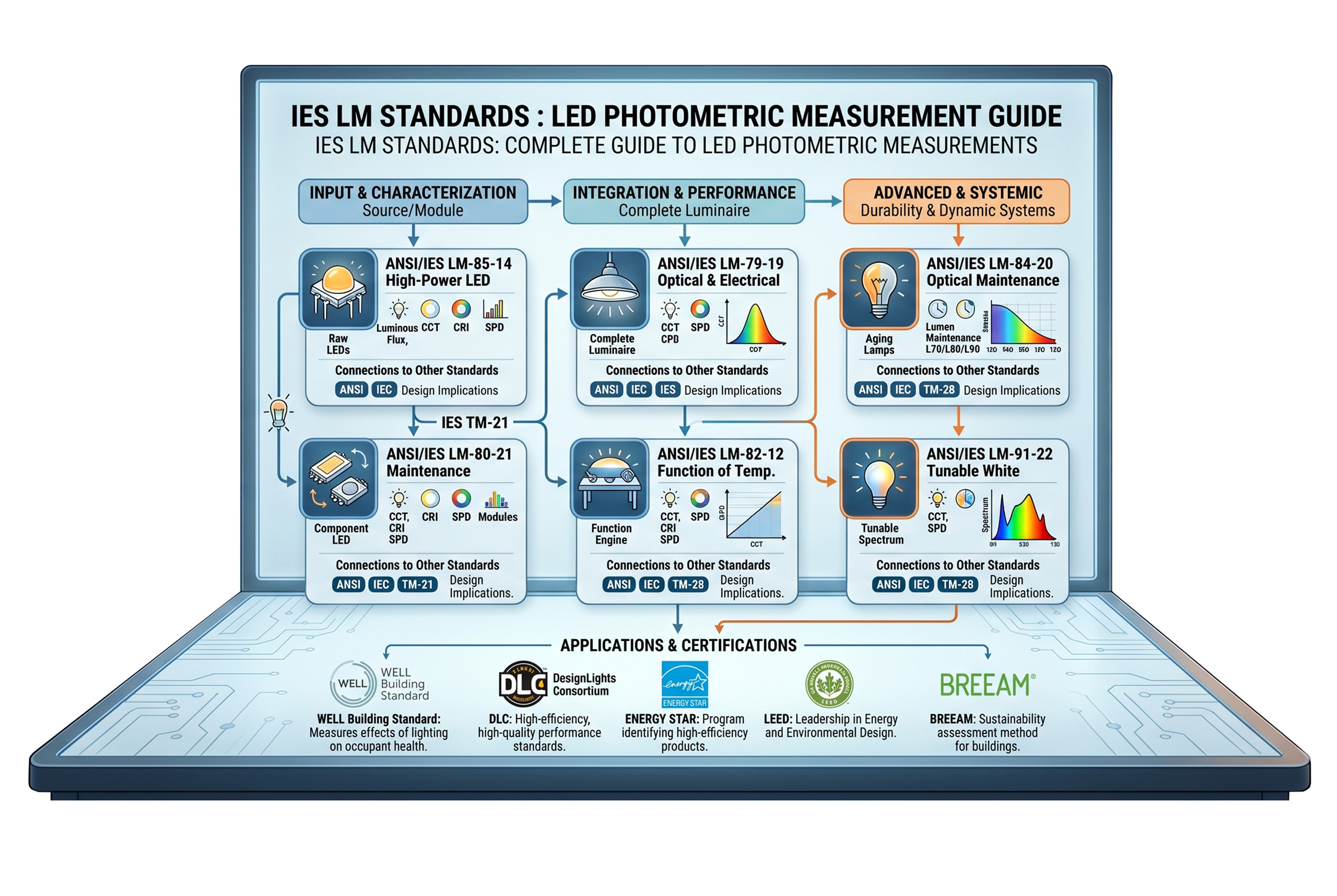
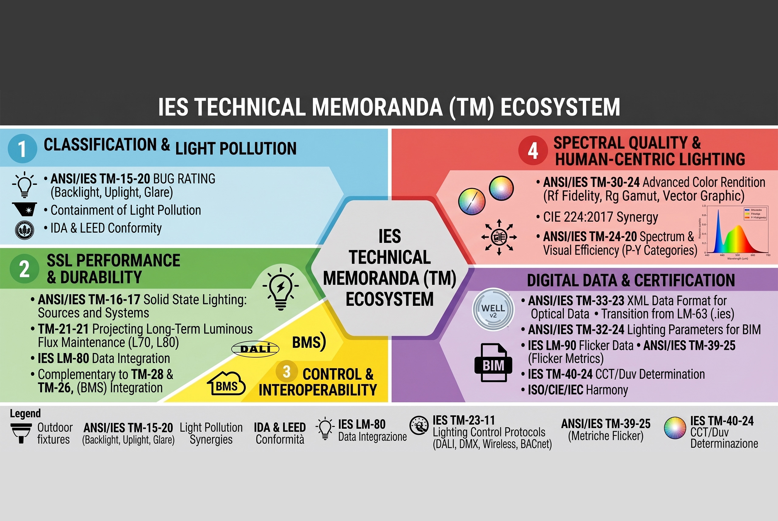
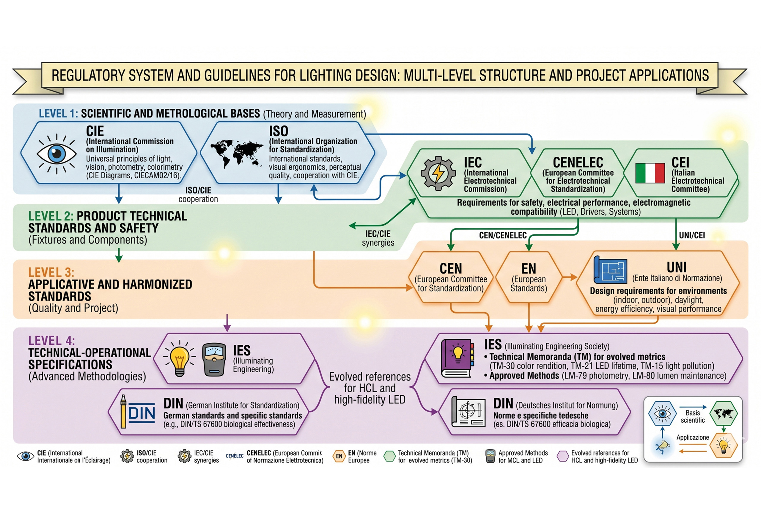
However, for a correct integration into the design processes, it is essential understand the regulatory framework which allows the adoption of these tools and defines their use. From metrological definitions everyone application specifications, The multilevel system of lighting standards represents the reference architecture to ensure quality, consistency and innovation in contemporary lighting design. It is from this awareness that a systematic and critical analysis of the main international regulations, with particular attention to the sources more up-to-date and operational, come i Technical Memoranda (TM) dell’IES, which in recent decades have contributed significantly to the transition towards a more conscious, integrated and human-centric design.

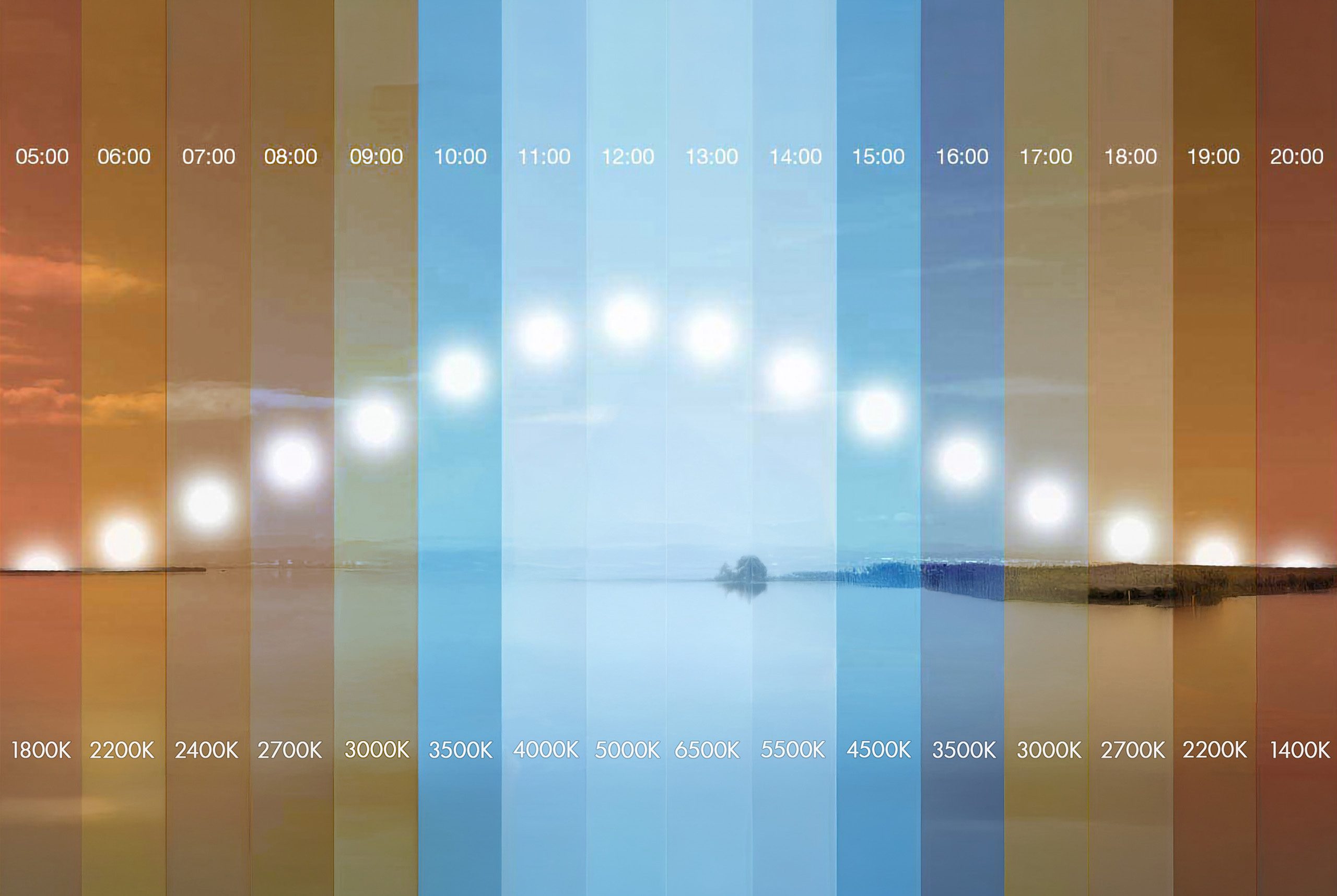
Now that we have understood how the spectral distribution of light influences the color rendering, visual perception and biological effects of light radiation, it is necessary to introduce a fundamental tool to represent and quantify the color of light: the chromaticity diagram. To fully understand the color perception in lighting design, it is of fundamental importance to start from the CIE 1931 chromaticity diagram, which represents in two-dimensional form the entire range of colors perceptible by the human eye. This diagram not only allows us to visualize the chromatic position of light sources, but also constitutes the theoretical basis for expressing crucial concepts such as color temperature and the CCT (Correlated Color Temperature).
In the diagram, each point corresponds to a specific shade of light, encoded via the coordinates (x, y) derived from the spectral sensitivity curves of the three theoretical photoreceptors (XYZ tristimulus). Within the figure, a curve called black body locus (black-body locus) shows the trajectory of the colors emitted by an ideal black body heated to different temperatures. This plot is the reference for determining the absolute color temperature, expressed in Kelvin (K).

The color temperature it therefore defines the colour of the light emitted by a source compared to that of a perfect black body at the same temperature. When the emitted light does not coincide exactly with that of a black body – as happens in most LED or fluorescent sources – the concept of correlated color temperature (CCT), which corresponds to the temperature of the black body whose emission is closer (in terms of color perception) to the analyzed source.
In the diagram, the distance from the blackbody curve represents the chromatic deviation the shorter the distance, the more neutral and natural the light will be. Conversely, sources that are distant from the locus (especially towards the greenish or purplish regions) can generate altered or less comfortable visual perceptions.
Another essential principle that the diagram illustrates is that of additive mixing of colors by drawing a line between two color points, all the colors along that line can be obtained by combining the two sources at the ends, with variable proportions. This concept is particularly useful in the design of multichannel LED sources, where white light is obtained by combining multiple diodes of different wavelengths.
In the 1931, when the International Commission on Illumination (CIE) published the famous chromaticity diagram, the panorama of light sources was dominated by incandescent lamps and, increasingly, from discharge lamps the diagram was conceived as a tool to represent the perceived chromaticity of light sources, that is, their color tone as interpreted by the human visual system. This model is based on a mathematical abstraction of the trichromatic vision of the human eye and uses the chromaticity coordinates (x, y) to describe every possible visible color by placing it in a two-dimensional area.

The incandescent lamps and the following ones halogen lamps (1959), based on the thermal incandescence of a metal filament (usually tungsten), emit a continuous spectrum which can be effectively represented in the diagram, since their behavior is similar to that of a black body. In this context, the color temperature has a direct physical meaning, and therefore the use of the black-body locus as a reference for classifying light sources according to their color tone (warm, neutral, cold). The light emitted by these sources is warm, continuous, and has high color fidelity, but their energy efficiency is relatively low.
At the same time, the discharge lamps, come i neon tubes, the mercury vapor lamps (low and high pressure) and those at sodium vapor these sources generate light by passing a current through an ionized gas, emitting a discontinuous spectrum, composed of selective spectral lines. Although the resulting chromaticity can still be traced in the CIE 1931 diagram to obtain a correlated color temperature (CCT), the quality of light— in terms of color rendering— cannot be deduced or faithfully represented with this instrument. In fact, sources with discontinuous spectra can occupy the same chromatic position of continuous spectrum sources, although they differ radically in their ability to reproduce colors.
With the advent of the LED, the situation has become further complicated. The light emitted by the diodes does not follow the principle of incandescence, but is based on a process of electroluminescence, in which the spectral composition is determined by the interaction between semiconductor materials (like the gallium nitride or the gallium phosphide and phosphor layers the result is a artificial spectral synthesis, selective and non-thermal, which produces curve SPD (Spectral Power Distribution) heterogeneous, characterized by spectral peaks and gaps, with significant effects on color fidelity, saturation and visual perception.
In this new scenario, the CIE diagram of 1931, although still being formally in force and recognized by organizations such as CIE, ISO and IEC, it turns out conceptually outdated for many practical applications related to LED light. Its perceptual non-uniformity implies that equal distances in the diagram do not correspond to chromatic differences perceived as equivalent, making it inadequate to accurately describe the color quality of composite spectrum sources.
To address these critical issues, the standard ANSI/IES TM‑30‑24, which today represents the most advanced and up-to-date tool for the color rendering analysis this document, published in its latest version in 2024, goes beyond the limitations of the traditional CRI (CIE Ra) introducing a multidimensional evaluation system based on two main metrics: Rf (fidelity index) e Rg (gamut index). The first measures color fidelity compared to an ideal reference, while the second quantifies the range and variation of color saturation. Both are calculated from 99 standard spectral samples and use it CAM02-UCS color space, which ensures greater consistency with human perception.

In addition to providing synthetic values (Rf, Rg), the TM‑30‑24 allows detailed analysis via local parameters (R<sub>fhj</sub>, R<sub>cs,hj</sub>) and graphical representations such as the Color Vector Graphic, highlighting the chroma and hue changes for each hue range. Thanks to this analytical granularity, it is possible to precisely evaluate the visual impact of light on objects, surfaces and people, offering designers useful tools for critical applications such as museums, retail environments, hospitals the schools.
In conclusion, the CIE diagram 1931 preserves a normative, historical and didactic value, remaining useful for identifying the basic chromaticity of the sources. However, in the contemporary context, dominated by the proliferation of broad-spectrum LEDs and from an increasing attention to visual comfort, perceptual performance and circadian stimulation, it has become essential to integrate chromatic analyses with more advanced and specific tools, capable of considering not only the position in the color space, but also the spectral composition, the real saturation and the biological implications of light. In light of what has been discussed, it is clear that the evolution of light sources has required more sophisticated metrics compared to classical instruments. The TM‑30‑24 today stands out as technical and regulatory reference for a lighting design based on real spectral data, updated perceptual criteria and measurable color performance.
However, for a correct integration into the design processes, it is essential understand the regulatory framework which allows the adoption of these tools and defines their use. From metrological definitions everyone application specifications, The multilevel system of lighting standards represents the reference architecture to ensure quality, consistency and innovation in contemporary lighting design. It is from this awareness that a systematic and critical analysis of the main international regulations, with particular attention to the sources more up-to-date and operational, come i Technical Memoranda (TM) dell’IES, which in recent decades have contributed significantly to the transition towards a more conscious, integrated and human-centric design.
Other Lighting Post
Other Lighting Post
This section brings together a comprehensive body of theoretical, scientific, and design insights into the theory of light applied to lighting design, systematically addressing the complex relationship between light, visual perception, and spatial design. The content develops the physical foundations of light, an understanding of the mechanisms of human vision, the differences between photopic and melanopic illuminance, and the biological impact of artificial light, integrating advanced metrics and contemporary interpretation criteria.
The page also explores the functioning of LED sources, the spectral and perceptual implications of solid-state light, the evolution of color rendering criteria, and the growing role of light as an informational and perceptual system, capable of influencing behavior, comfort, and the quality of spatial experience.
Ample space is dedicated to the relevant regulatory and technical framework, international standards, sustainability protocols, and control systems, understood as essential tools for rigorous, measurable, and consistent design.
Overall, the section provides a vision of the theory of light as the cultural and operational basis of lighting design, in which scientific knowledge, perceptual awareness, and design method converge to guide the lighting designer in the construction of balanced, legible, and qualitatively significant spaces.
This section brings together a comprehensive body of theoretical, scientific, and design insights into the theory of light applied to lighting design, systematically addressing the complex relationship between light, visual perception, and spatial design. The content develops the physical foundations of light, an understanding of the mechanisms of human vision, the differences between photopic and melanopic illuminance, and the biological impact of artificial light, integrating advanced metrics and contemporary interpretation criteria.
The page also explores the functioning of LED sources, the spectral and perceptual implications of solid-state light, the evolution of color rendering criteria, and the growing role of light as an informational and perceptual system, capable of influencing behavior, comfort, and the quality of spatial experience.
Ample space is dedicated to the relevant regulatory and technical framework, international standards, sustainability protocols, and control systems, understood as essential tools for rigorous, measurable, and consistent design.
Overall, the section provides a vision of the theory of light as the cultural and operational basis of lighting design, in which scientific knowledge, perceptual awareness, and design method converge to guide the lighting designer in the construction of balanced, legible, and qualitatively significant spaces.