Dalla-Percezione-alla-Funzione-L’Influenza-della-Temperatura-di-Colore-sullo-Spazio-Illuminato-slide

From Perception to Function: The Influence of Color Temperature on Illuminated Space

Color temperature as a perceptual language: designing atmospheres, guiding vision and shaping space

After exploring the scientific bases, regulatory references and advanced tools to describe light – from  the electromagnetic spectrum to melanopic parameters, from CIE diagrams to IES Technical Memoranda, up to solid-state lighting (SSL) – we focused on both the comparative analysis between traditional LEDs and μPLS as new digital light engine, and on the emerging concept of light that informs, with the opportunities and risks that this transformation brings. It is important, however, to return to what is immediately perceptible: the way in which light shapes the space, informs the user's psychology and contributes to the functionality of the environment. In this perspective, the issue of color temperature takes on a central role, acting as a bridge between technical  and regulatory analyses and the concrete experience of users.

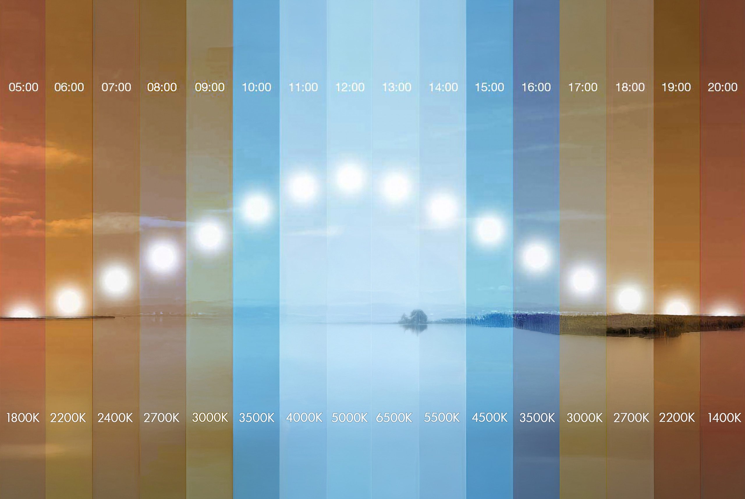
Understanding the relationship between color temperature, light spectrum and visual perception is essential to design environments that promote comfort, psychophysical well-being and optimal visual performance. Correlated color temperature (CCT), expressed in Kelvin (K), is not limited to defining an aesthetic appearance, but directly affects color perception, neurophysiological stimulation and interaction with  human circadian rhythms.

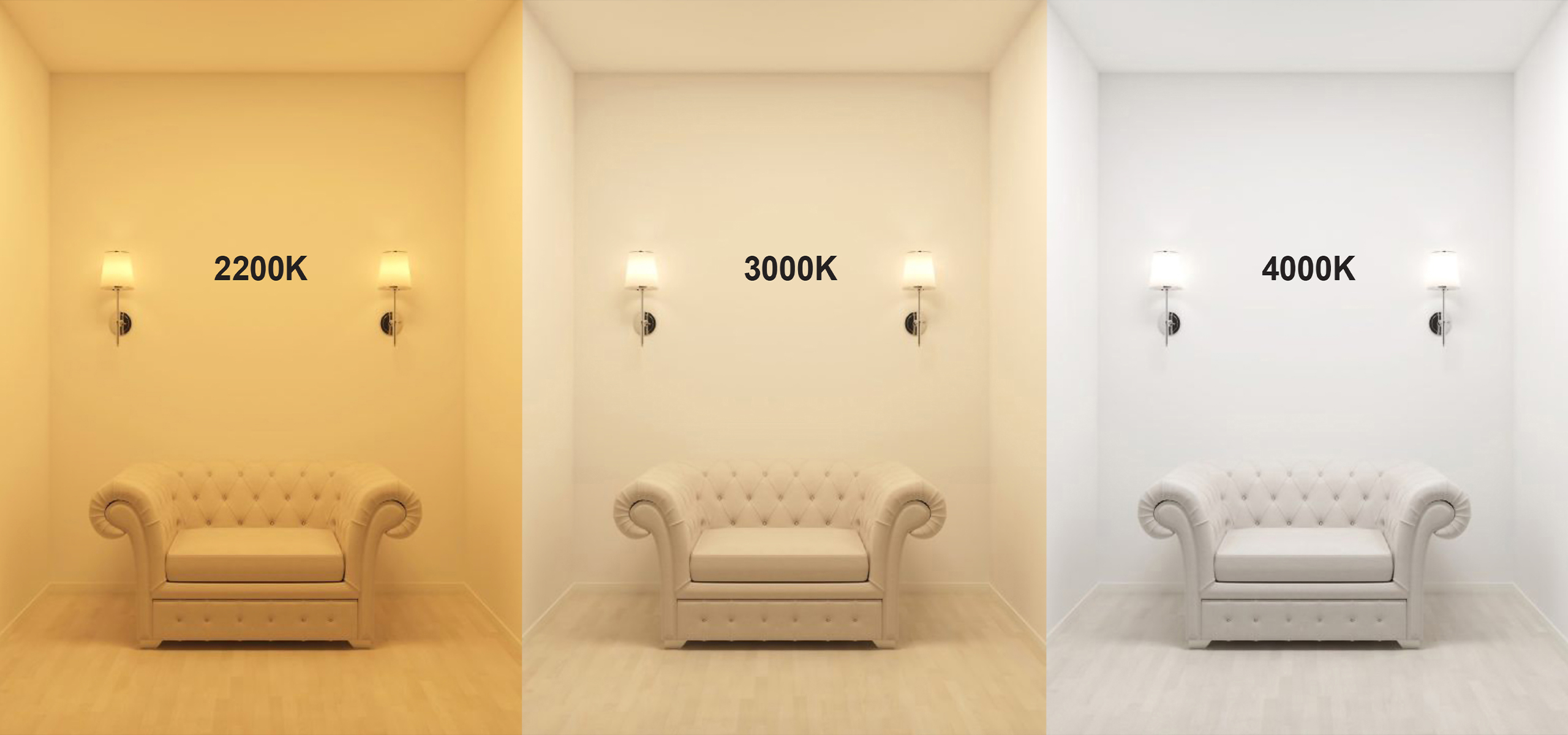
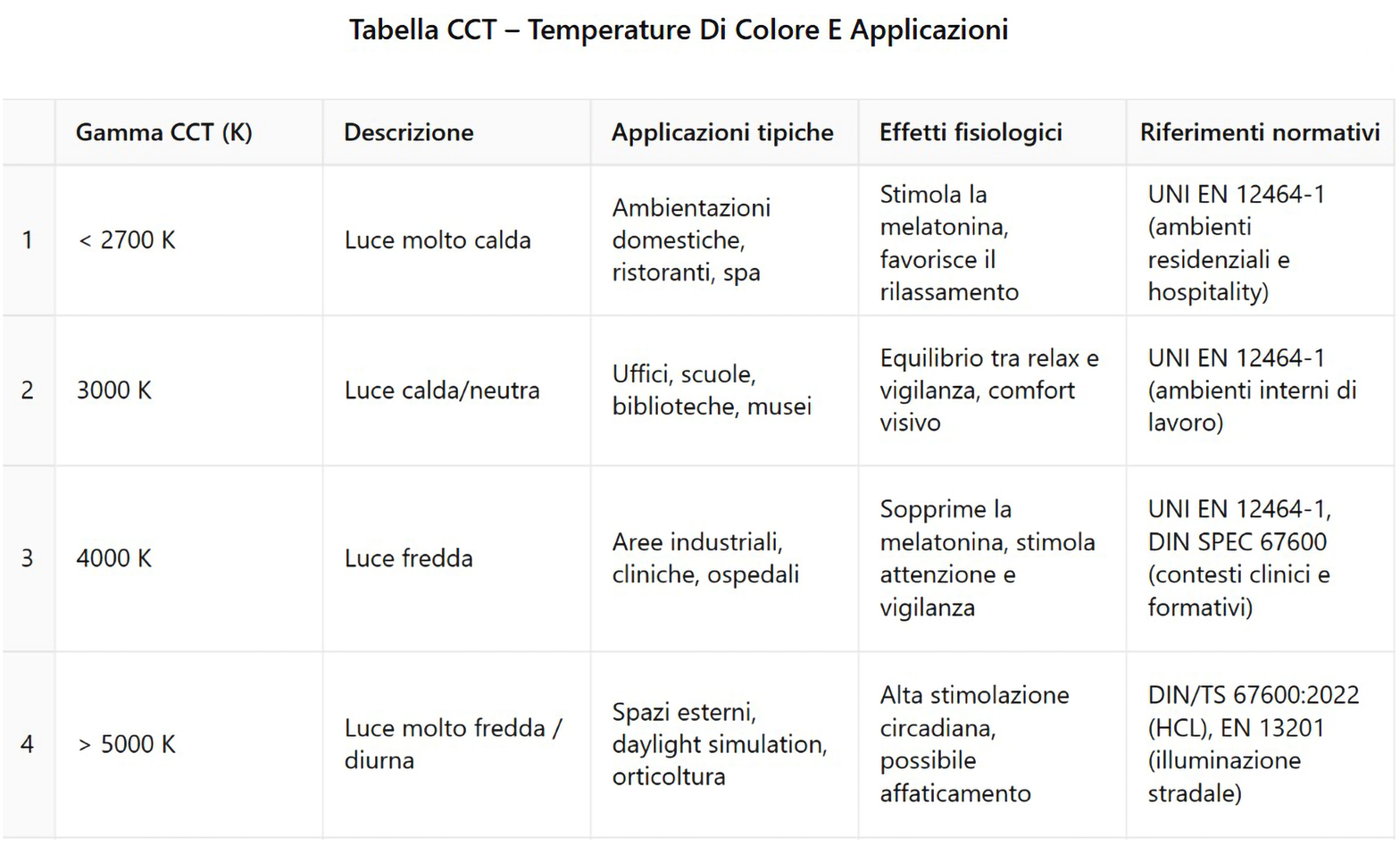
Warm light, with CCT around 2200 K, is associated with a sense of relaxation and intimacy, making it particularly suitable for residential environments, hospitality spaces or decompression areas, where a calm state of mind is desired. In this range, the red component of the spectrum dominates, stimulating melatonin production and supporting sleep mechanisms. However, an excessive predominance of warm tones may prove unsuitable in situations that require attention and vigilance.

Neutral light, generally between 3000 and 3500 K, represents a condition of balance between stimulation and visual comfort. It is ideal for educational, work and healthcare contexts, where light must guarantee legibility, chromatic accuracy and a good level of concentration without generating fatigue. Standards such as UNI EN 12464-1:2021 indicate it as a reference for environments where the natural perception of colors is an operational requirement.

At the opposite extreme we find cold light, around 4000 K and above, characterized by a marked blue component  of the spectrum. This light exerts an energizing effect on the central nervous system, promoting mental alertness, responsiveness and active alertness. It is the preferred choice for industrial spaces, laboratories, healthcare facilities or educational environments where visual activity is intense and continuous. From a biological point of view, it stimulates melanopsin retinal photoreceptors, inhibits melatonin secretion and can improve cognitive performance during daylight hours. However, if not balanced over time, it can interfere with the natural circadian rhythm, generating sleep disorders or chronic fatigue.

In addition to physiological effects, color temperature has a significant impact on the perception of colors in space. By combining sources with different CCTs, it is possible to obtain chromatic contrasts, emphasize materials and textures, or create perceptual sequences that guide the eye and define the visual hierarchy of environments. However, this operation requires attention: the use of sources declared as "neutral" but with a discontinuous spectrum, as often happens in low-cost LEDs, can generate perceptual incoherence effects.

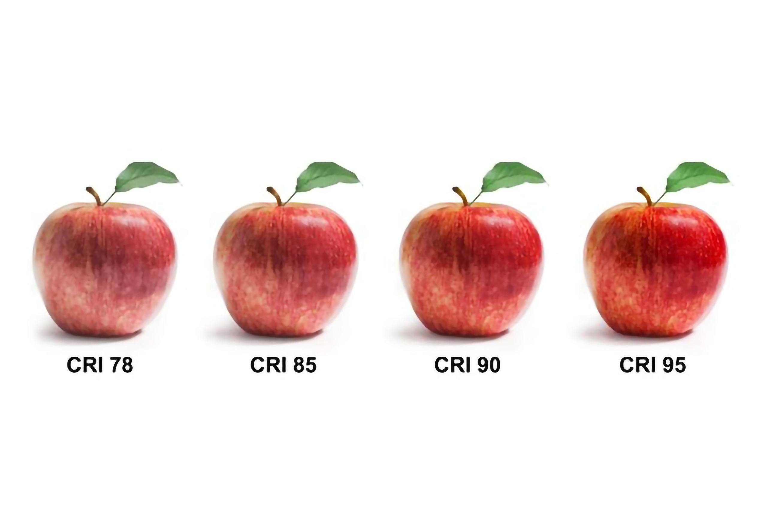
An emblematic case occurs when two sources, both declared at 4000 K, show a profoundly different visual rendering due to the spectral composition. This phenomenon, known as spectral metamerism, involves an altered perception of colors, particularly in warm shades such as reds, oranges and skin tones, which are desaturated, flattened or unnatural. Even with a "correct" color temperature, a low CRI or a  low RF index, as detectable by TM-30, shows insufficient color fidelity and impairs visual comfort.

From a biological point of view, light with an inhomogeneous or excessively blue-shifted spectrum can generate chromatic inconsistencies, visual fatigue and neurovisual disturbances, especially if associated with prolonged exposure. In environments with different sources, but declared with the same CCT, perceptual discontinuities between adjacent spaces may occur, with negative impacts on architectural cohesion and on the experiential quality  of the project.

Designing based on the nominal color temperature alone  is therefore insufficient. It is necessary to proceed with  accurate spectrometric analyses that detect the real spectral composition of the source, verify the coherence between CCT, CRI, Rf and Rg, and allow an integrated evaluation of the perceptual and physiological effects of light.
Only through a scientifically based, experientially verified and design-aware approach, is it possible to give shape to a light that not only illuminates, but interprets and enhances the experience of space. In this sense, designing light means taking care of the relationship between body, mind and architecture, building a design based on technical knowledge, regulatory expertise and perceptive sensitivity.

Dalla-Percezione-alla-Funzione-L’Influenza-della-Temperatura-di-Colore-sullo-Spazio-Illuminato-slide

From Perception to Function: The Influence of Color Temperature on Illuminated Space

Color temperature as a perceptual language: designing atmospheres, guiding vision and shaping space

After exploring the scientific bases, regulatory references and advanced tools to describe light – from  the electromagnetic spectrum to melanopic parameters, from CIE diagrams to IES Technical Memoranda, up to solid-state lighting (SSL) – we focused on both the comparative analysis between traditional LEDs and μPLS as new digital light engine, and on the emerging concept of light that informs, with the opportunities and risks that this transformation brings. It is important, however, to return to what is immediately perceptible: the way in which light shapes the space, informs the user's psychology and contributes to the functionality of the environment. In this perspective, the issue of color temperature takes on a central role, acting as a bridge between technical  and regulatory analyses and the concrete experience of users.

Understanding the relationship between color temperature, light spectrum and visual perception is essential to design environments that promote comfort, psychophysical well-being and optimal visual performance. Correlated color temperature (CCT), expressed in Kelvin (K), is not limited to defining an aesthetic appearance, but directly affects color perception, neurophysiological stimulation and interaction with  human circadian rhythms.

Warm light, with CCT around 2200 K, is associated with a sense of relaxation and intimacy, making it particularly suitable for residential environments, hospitality spaces or decompression areas, where a calm state of mind is desired. In this range, the red component of the spectrum dominates, stimulating melatonin production and supporting sleep mechanisms. However, an excessive predominance of warm tones may prove unsuitable in situations that require attention and vigilance.

Neutral light, generally between 3000 and 3500 K, represents a condition of balance between stimulation and visual comfort. It is ideal for educational, work and healthcare contexts, where light must guarantee legibility, chromatic accuracy and a good level of concentration without generating fatigue. Standards such as UNI EN 12464-1:2021 indicate it as a reference for environments where the natural perception of colors is an operational requirement.

At the opposite extreme we find cold light, around 4000 K and above, characterized by a marked blue component  of the spectrum. This light exerts an energizing effect on the central nervous system, promoting mental alertness, responsiveness and active alertness. It is the preferred choice for industrial spaces, laboratories, healthcare facilities or educational environments where visual activity is intense and continuous. From a biological point of view, it stimulates melanopsin retinal photoreceptors, inhibits melatonin secretion and can improve cognitive performance during daylight hours. However, if not balanced over time, it can interfere with the natural circadian rhythm, generating sleep disorders or chronic fatigue.

In addition to physiological effects, color temperature has a significant impact on the perception of colors in space. By combining sources with different CCTs, it is possible to obtain chromatic contrasts, emphasize materials and textures, or create perceptual sequences that guide the eye and define the visual hierarchy of environments. However, this operation requires attention: the use of sources declared as "neutral" but with a discontinuous spectrum, as often happens in low-cost LEDs, can generate perceptual incoherence effects.

An emblematic case occurs when two sources, both declared at 4000 K, show a profoundly different visual rendering due to the spectral composition. This phenomenon, known as spectral metamerism, involves an altered perception of colors, particularly in warm shades such as reds, oranges and skin tones, which are desaturated, flattened or unnatural. Even with a "correct" color temperature, a low CRI or a  low RF index, as detectable by TM-30, shows insufficient color fidelity and impairs visual comfort.

From a biological point of view, light with an inhomogeneous or excessively blue-shifted spectrum can generate chromatic inconsistencies, visual fatigue and neurovisual disturbances, especially if associated with prolonged exposure. In environments with different sources, but declared with the same CCT, perceptual discontinuities between adjacent spaces may occur, with negative impacts on architectural cohesion and on the experiential quality  of the project.

Designing based on the nominal color temperature alone  is therefore insufficient. It is necessary to proceed with  accurate spectrometric analyses that detect the real spectral composition of the source, verify the coherence between CCT, CRI, Rf and Rg, and allow an integrated evaluation of the perceptual and physiological effects of light.

Only through a scientifically based, experientially verified and design-aware approach, is it possible to give shape to a light that not only illuminates, but interprets and enhances the experience of space. In this sense, designing light means taking care of the relationship between body, mind and architecture, building a design based on technical knowledge, regulatory expertise and perceptive sensitivity.
Other Lighting Post

Other Lighting Post

This section brings together a comprehensive body of theoretical, scientific, and design insights into the theory of light applied to lighting design, systematically addressing the complex relationship between light, visual perception, and spatial design. The content develops the physical foundations of light, an understanding of the mechanisms of human vision, the differences between photopic and melanopic illuminance, and the biological impact of artificial light, integrating advanced metrics and contemporary interpretation criteria.

The page also explores the functioning of LED sources, the spectral and perceptual implications of solid-state light, the evolution of color rendering criteria, and the growing role of light as an informational and perceptual system, capable of influencing behavior, comfort, and the quality of spatial experience.

Ample space is dedicated to the relevant regulatory and technical framework, international standards, sustainability protocols, and control systems, understood as essential tools for rigorous, measurable, and consistent design.

Overall, the section provides a vision of the theory of light as the cultural and operational basis of lighting design, in which scientific knowledge, perceptual awareness, and design method converge to guide the lighting designer in the construction of balanced, legible, and qualitatively significant spaces.

This section brings together a comprehensive body of theoretical, scientific, and design insights into the theory of light applied to lighting design, systematically addressing the complex relationship between light, visual perception, and spatial design. The content develops the physical foundations of light, an understanding of the mechanisms of human vision, the differences between photopic and melanopic illuminance, and the biological impact of artificial light, integrating advanced metrics and contemporary interpretation criteria.

The page also explores the functioning of LED sources, the spectral and perceptual implications of solid-state light, the evolution of color rendering criteria, and the growing role of light as an informational and perceptual system, capable of influencing behavior, comfort, and the quality of spatial experience.

Ample space is dedicated to the relevant regulatory and technical framework, international standards, sustainability protocols, and control systems, understood as essential tools for rigorous, measurable, and consistent design.

Overall, the section provides a vision of the theory of light as the cultural and operational basis of lighting design, in which scientific knowledge, perceptual awareness, and design method converge to guide the lighting designer in the construction of balanced, legible, and qualitatively significant spaces.

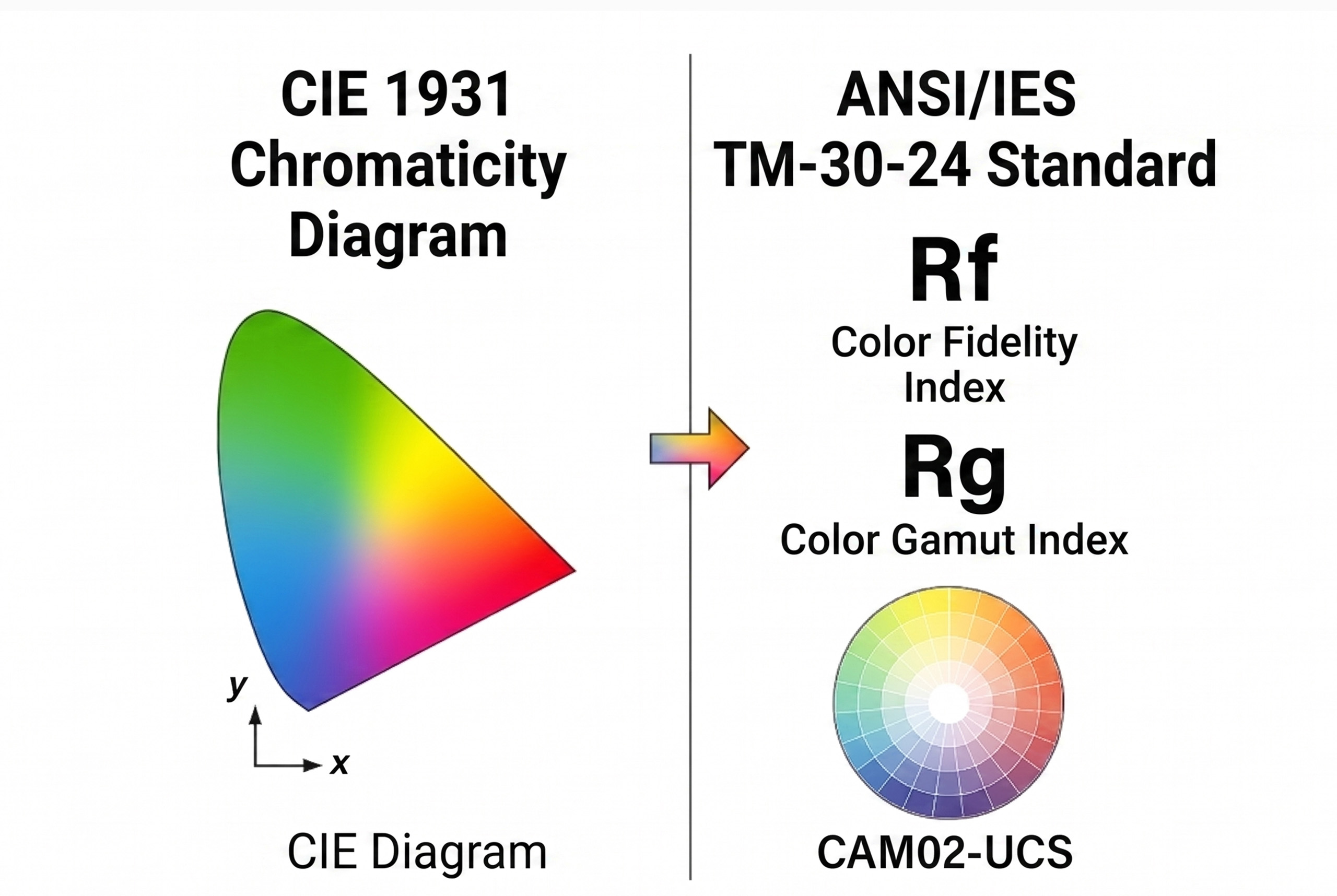
Beyond the CRI: The New Era of Colour Rendering in Architectural Light How Rf and Rg redefine color rendering for a light designed on the visual experience Continuing the analysis…
La-luce-che-informa-rivoluzione-o-rischio-per-il-futuro-dell’illuminazione-copertina-eng
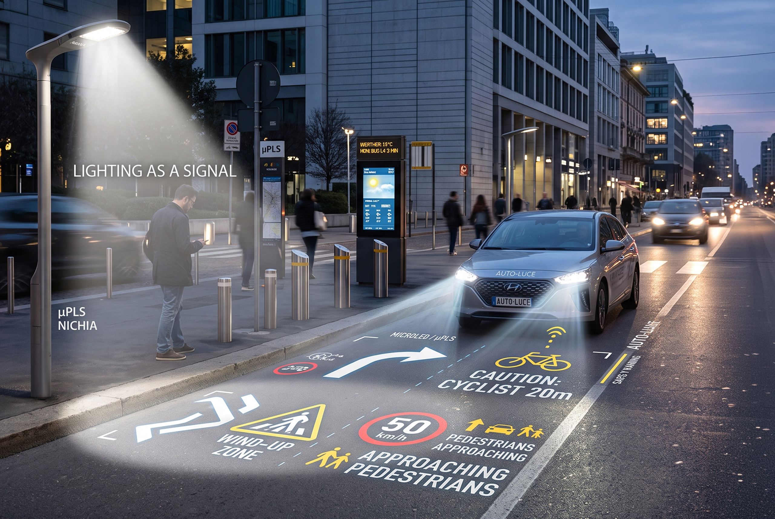
The Light That Informs: Revolution or Risk for the Future of Lighting? μPLS and microLED between innovation and danger of visual excess Historically, we are used to thinking of artificial…
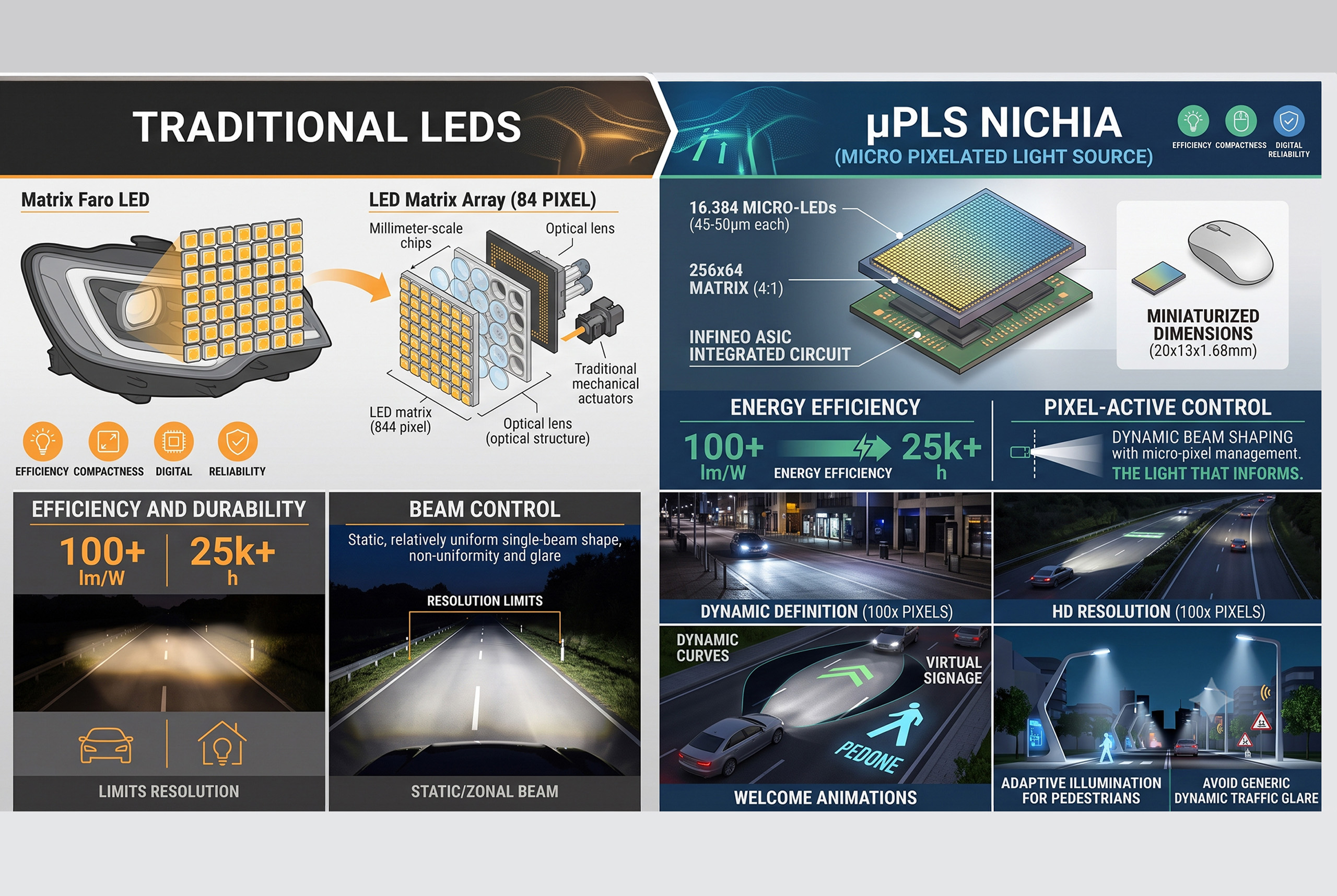
Differences Between Traditional LEDs and μPLS by Nichia: From the Car to the City, the Path of the Digital Light Engine From road safety to smart city: μPLS and high-resolution…
The Silent Revolution of LEDs: The Crisis of Seeing in the Age of Solid-State Lighting From Daylight to Electrical Simulation, Digital Lighting Redefines Perception, Dissolving the Link Between Visual Experience…
Technical Regulations for Electrical Systems and Lighting in Yachts Electrical safety, visual comfort and ship compliance according to IEC, ISO, CEI, RINA and DNV standards. Electrical Safety and Wiring in…
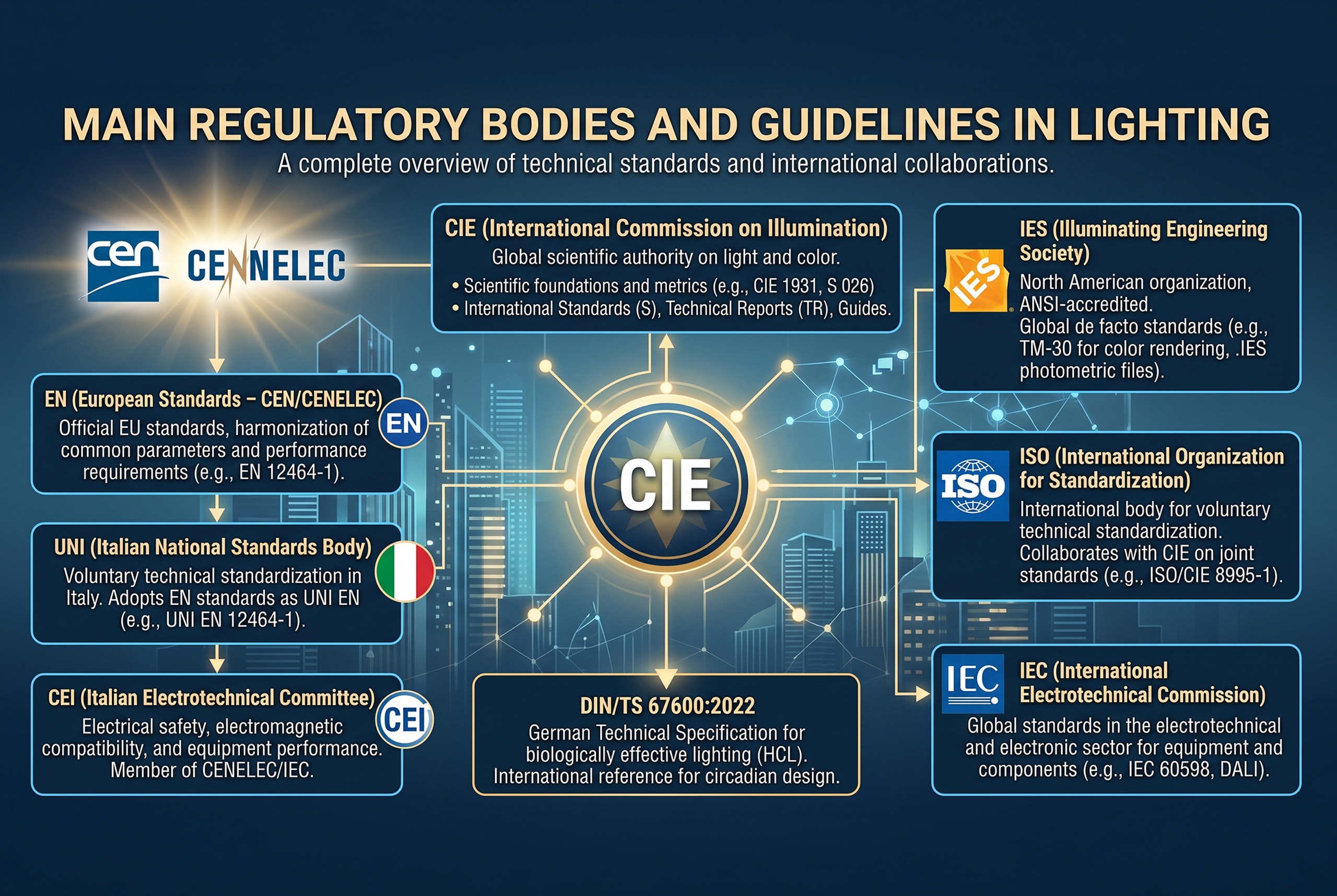
Main Regulatory Bodies and Guidelines in Lighting Technology A comprehensive framework on technical standards, international collaborations and key documents for designing light according to scientific and performance criteria. CIE (International…
Standard-Lighting-Measurements-(LM)-dell’IES-Codici,-Struttura-e-Implicazioni-Progettuali_Copertina-eng
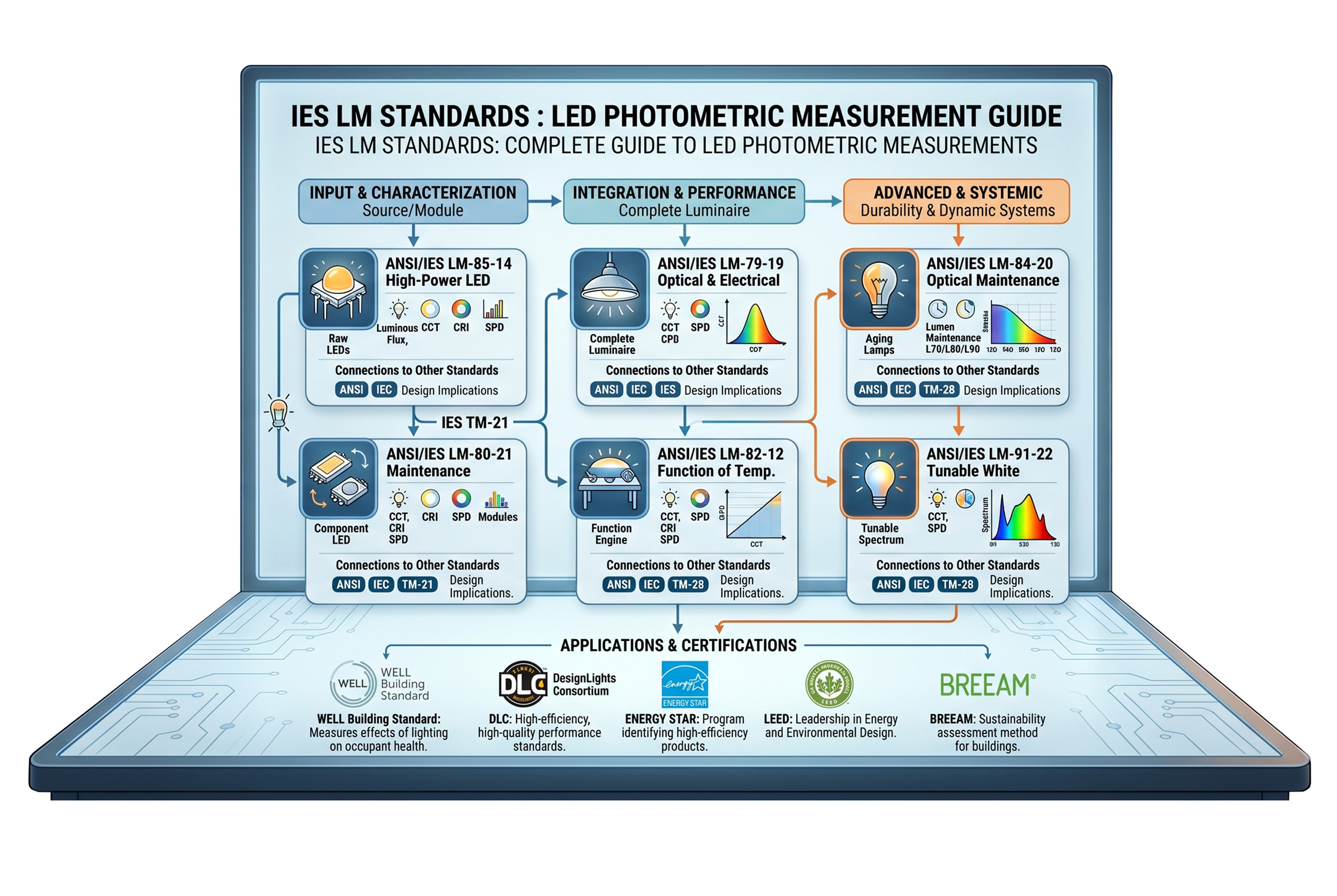
IES Standard Lighting Measurements (LM): Codes, Structure, and Design Implications Technical guide to LM standards for measuring the photometric, chromatic, and electrical performance of LEDs, modules, and luminaires. After having…
Standard-Technical-Memoranda-(TM)-dell’IES-Codici,-Struttura-e-Implicazioni-Progettuali_Copertina-eng
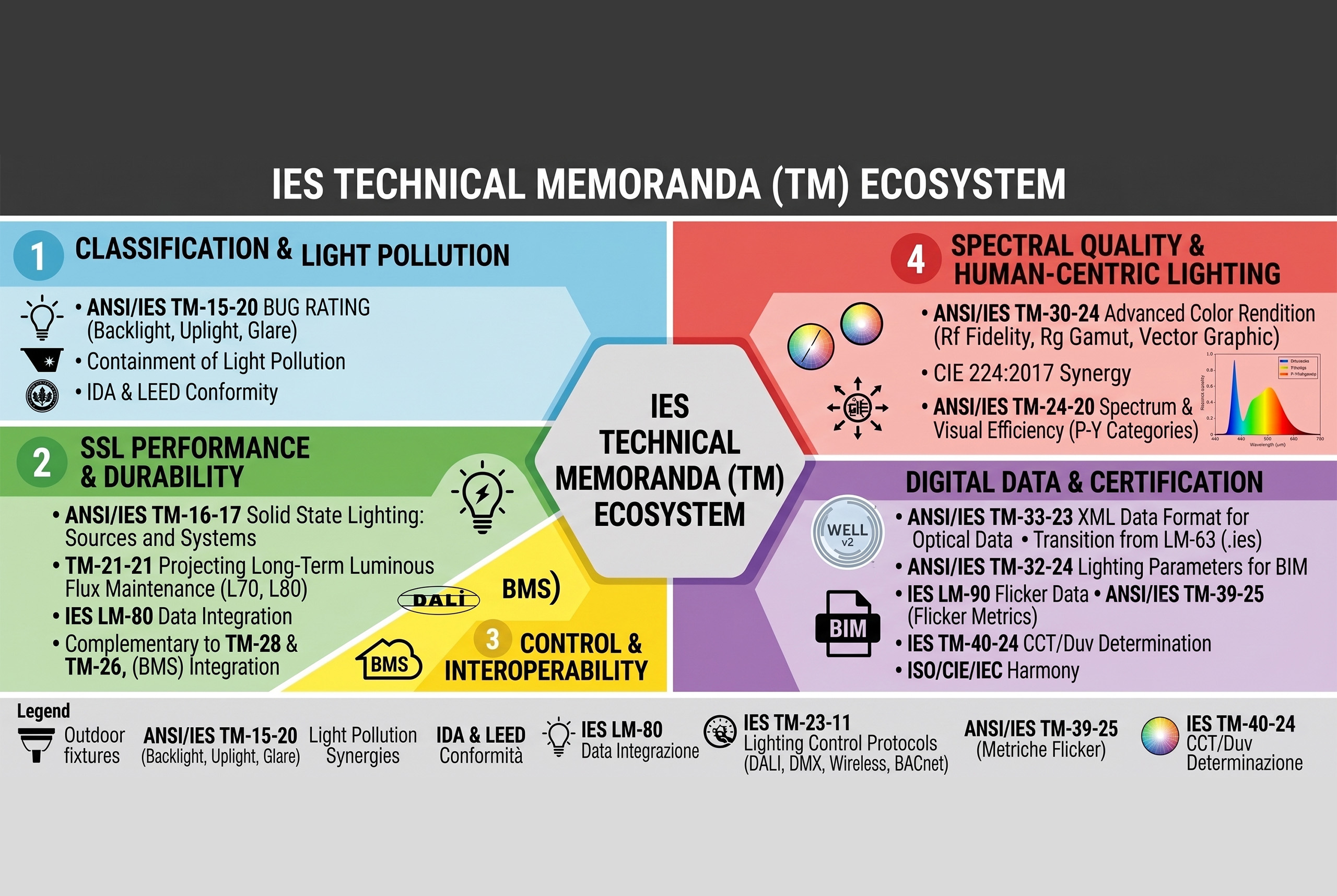
IES Standard Technical Memoranda (TM): Codes, Structure, and Design Implications A technical guide to the use and interpretation of TM documents in lighting design The following insight is dedicated to…
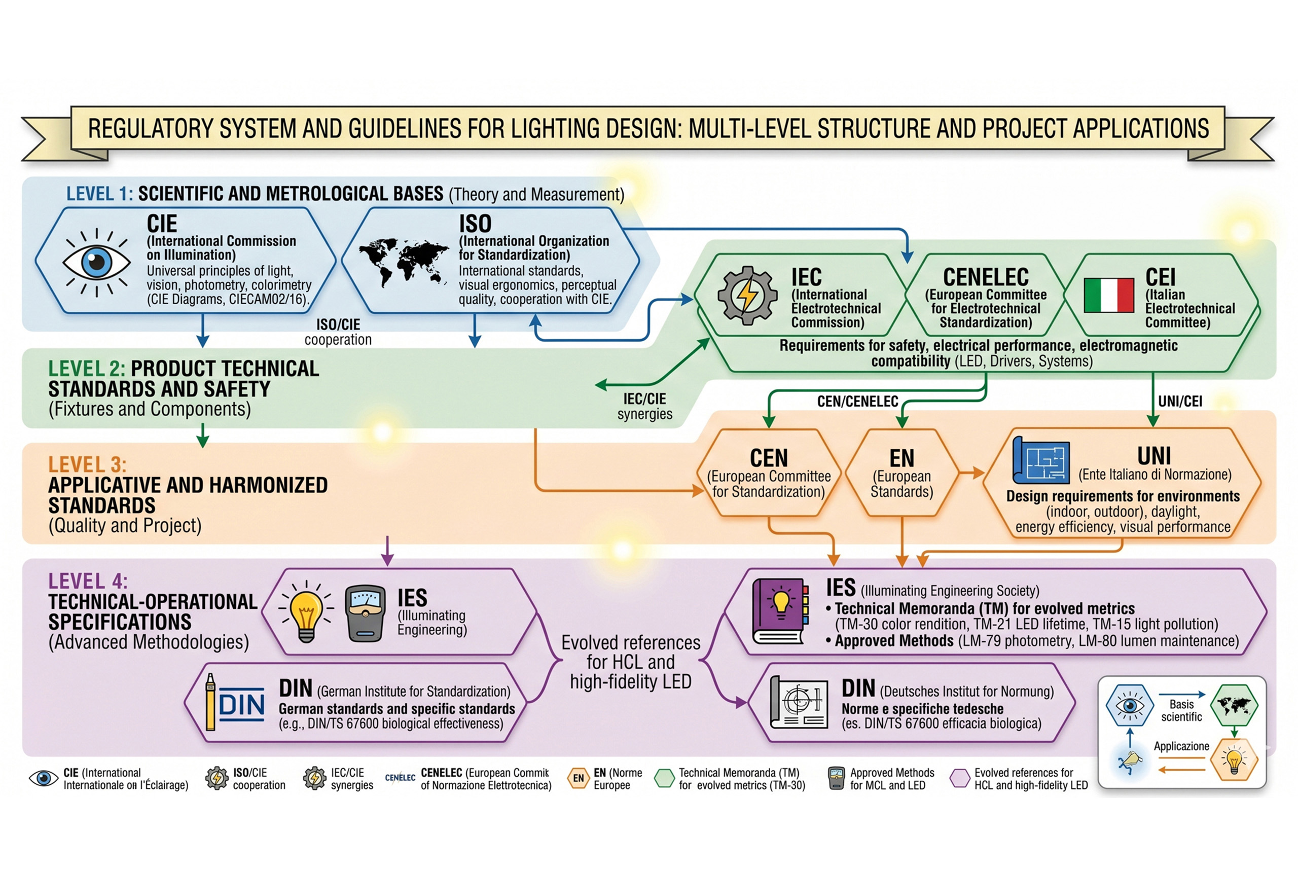
Authoritative Standards and Guidelines in Lighting Technology: Multilevel Structure and Design Applications A complex regulatory system for designing light with technical rigor and application coherence The evolution of light sources…
With the advent of LED sources, can we define the 1931 CIE diagram as obsolete? Formally no, but practically yes, in many application contexts. Now that we have understood how…
digital light and perceived thresholds - cover
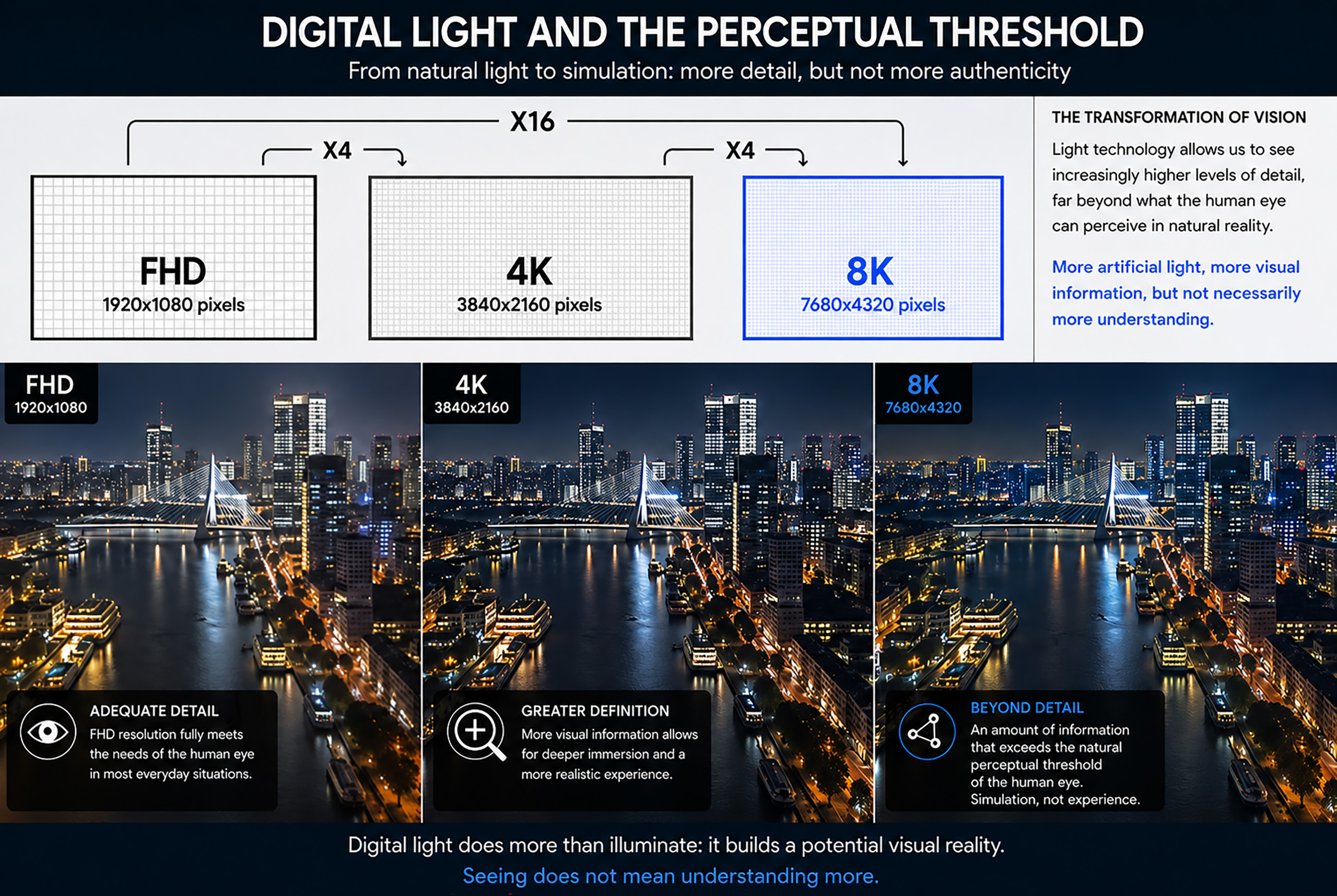
Digital Lighting and Visual Perception: the Dissolution of the See/Understand Relationship How electric light is changing the relationship between seeing, experiencing, and understanding the world In today's era of digital…
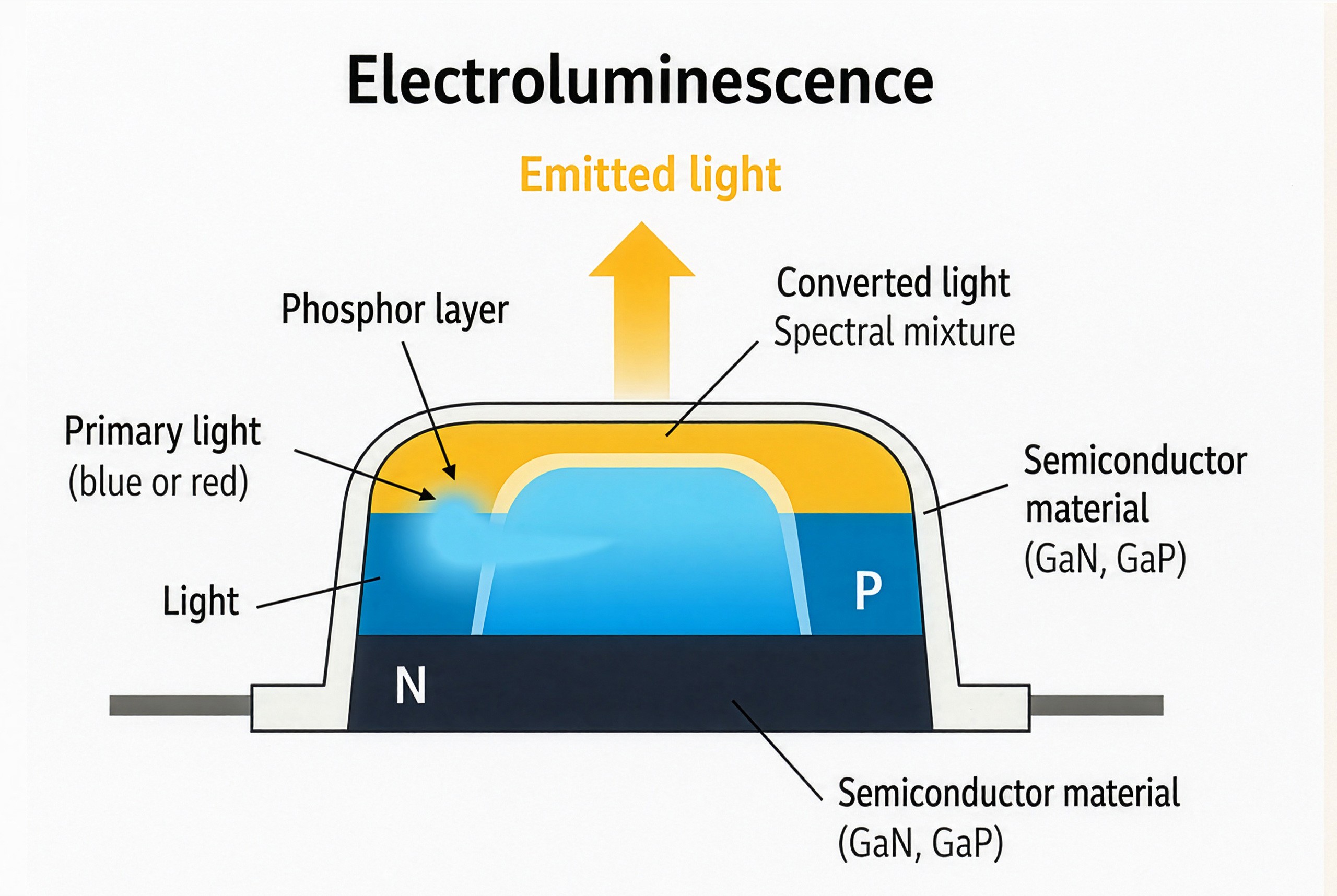
Electroluminescence Process in LED Semiconductor Devices
How LEDs Work: Electroluminescence, Materials, and the Light Spectrum From semiconductor structure to color rendering: how LED light takes shape Visible light, although perceived as a continuous and unified phenomenon,…
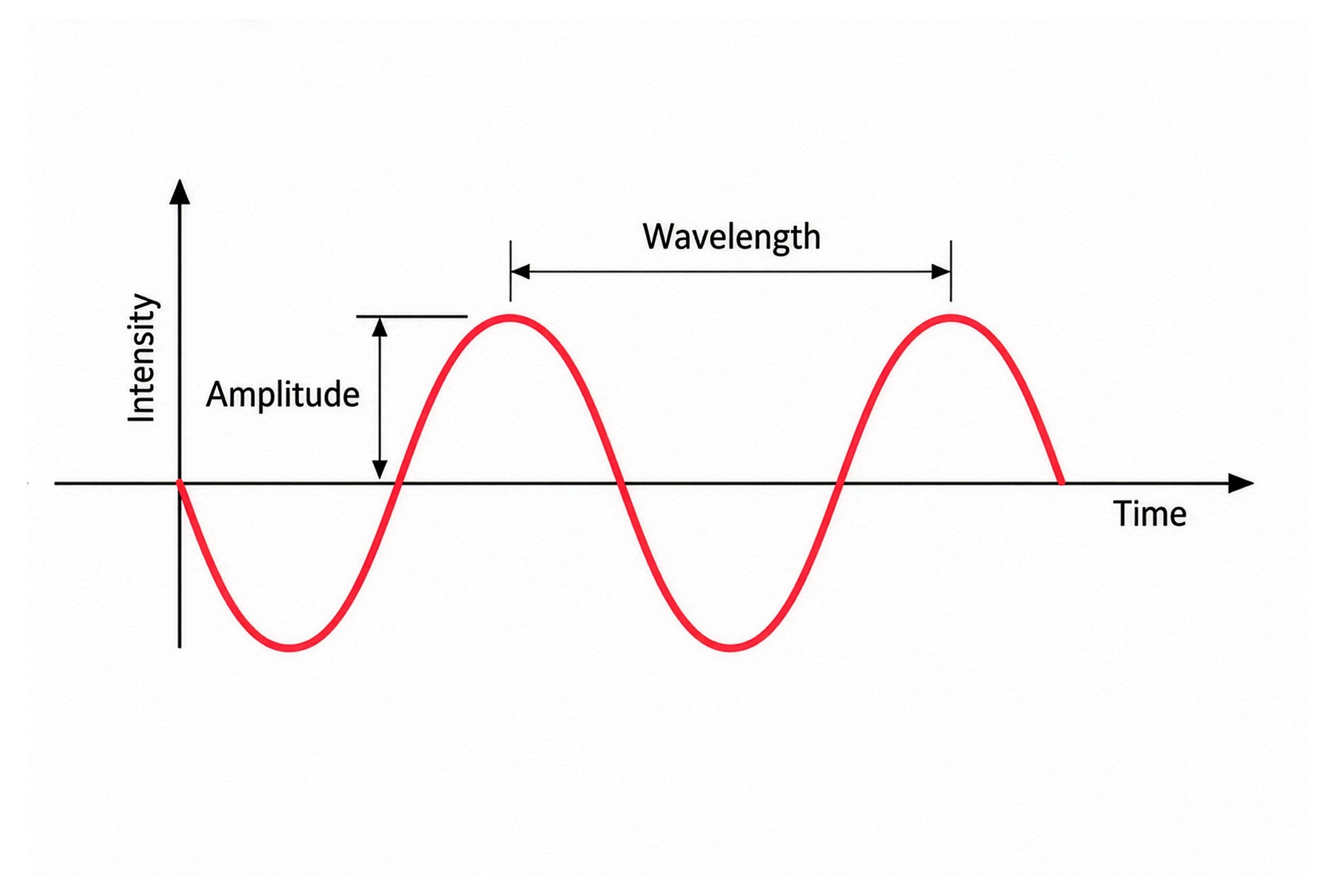
Fundamental Properties of Electromagnetic-Waves Amplitude and Wavelength
Visible Light and the Electromagnetic Spectrum: Physical Principles for Lighting Design How wavelengths influence perception, color, and light design After examining how the human eye adapts to different illumination levels…
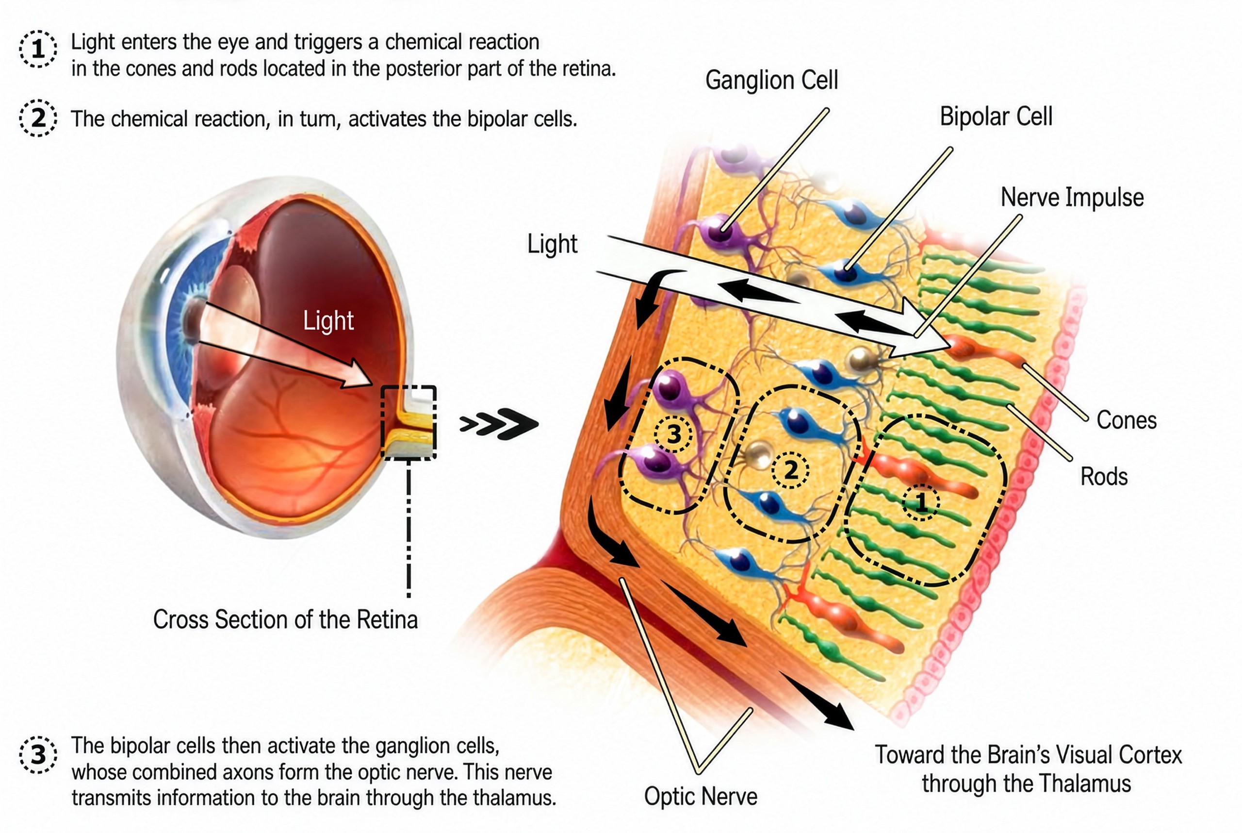
Visual Signal Transmission Pathway in the Human Retina
Photopic vs Melanopic Illuminance: Definition and Spectral Sensitivity MEDI, EML, and CS. Three essential indicators for measuring the circadian impact of artificial light The perception of light varies according to…
Light Perception Human Eye Capabilities and Limitations
Light Perception: Capabilities and Limits of the Human Eye Understanding how the human eye works is the first step toward designing light with awareness  The human eye is a highly…
Lighting-Design-e-Teoria-della-Luce
Lighting Design and Light Theory Complexity in the relationship between light, perception, and design   How does a lighting designer develop a lighting project? Which disciplines should a rigorous lighting…
MENU