Beyond the CRI: The New Era of Colour Rendering in Architectural Light

How Rf and Rg redefine color rendering for a light designed on the visual experience

Continuing the analysis of the perceptive quality of light, it is evident that colour rendering, understood in the broadest and most up-to-date sense of the term, represents an essential dimension for conscious lighting design. If the color temperature establishes the emotional and biological tone of the light, it is the color rendering that defines the perceptual verisimilitude, or the consistency between what we see and what we expect to see in a given visual context.

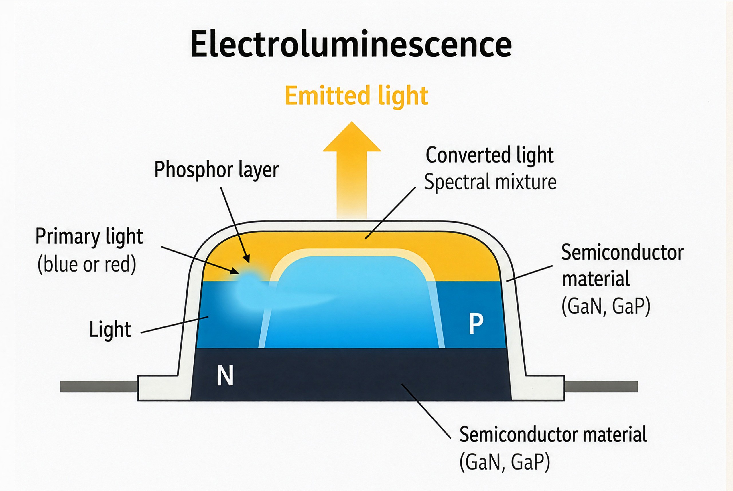
The CRI (Color Rendering Index), although historically consolidated and still required by many standards (such as UNI EN 12464-1:2021 for indoor work environments), shows obvious limitations in the evaluation of modern sources, in particular LEDs with an inhomogeneous spectrum. The introduction of sources with non-continuous spectral emissions, such as those based on blue LEDs coated with phosphors, has in fact made it necessary to rethink the measuring instruments.

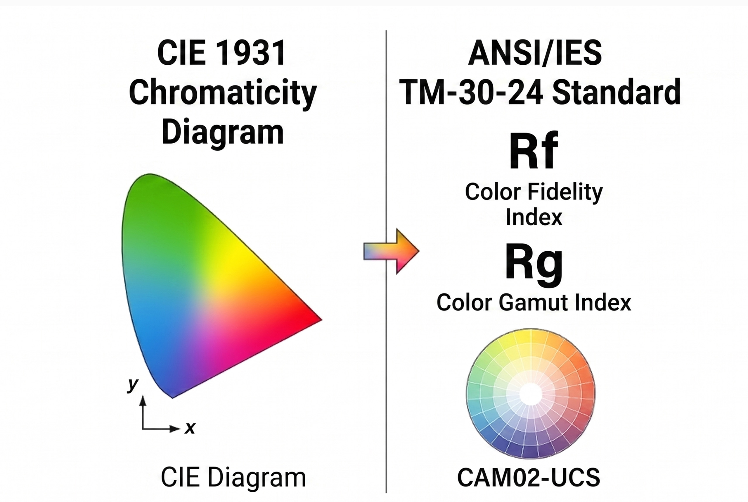
The Color Fidelity Index (RF), introduced by CIE 224:2017 and an integral part of the TM-30 system, represents a significant evolution. Unlike CRI, which uses 8 color samples (plus 6 optional), RF is based on 99 more spectrally representative samples from real surfaces, including human skin tones and natural materials, thus offering greater reliability in the evaluation of color fidelity.

But passing the CRI does not end with the mere numerical expansion of the test samples: it is based on a new understanding of the visual experience, in which it is not only the accuracy of the color compared to a standard that counts, but also the emotional effect, the chromatic attractiveness and the perceived vividness. For this reason, CIE 253:2024 has consolidated a new phase of research, introducing complementary perceptual metrics, which include assessments of preference, perceived saturation and naturalness.

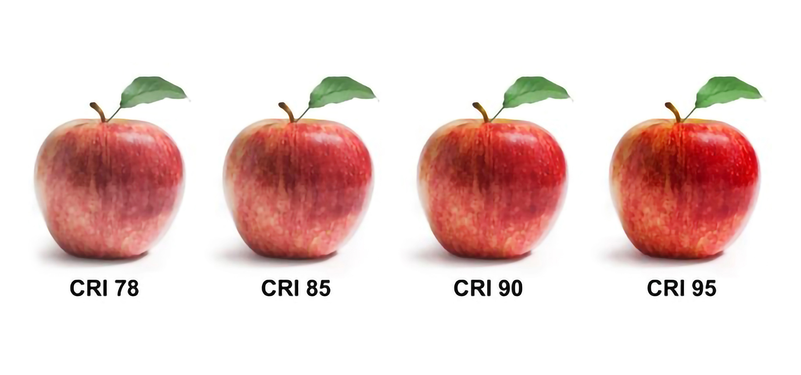
An exemplary case is represented by the image showing a comparative sequence of red apples illuminated by sources with different CRI (78, 85, 90, 95). Progressive variation allows you to intuitively observe how the perceptual quality of the color changes  as color fidelity changes. Reds initially appear attenuated and dull (CRI 78), progressively improve (CRI 85 and 90) and achieve a consistent and natural rendering with CRI 95.

However, this same image highlights the structural limitations of the CRI. While it offers numerical data,  it does not distinguish which hues are compromised, how much saturation is altered, nor does it provide information on vibrance or color preference. The CRI quantifies an average deviation from an ideal reference, but it does not tell how light is perceived or how it affects the sensory quality of the visual experience. For this reason, the CRI must be integrated with indices such as Rf and Rg, which offer a more articulated reading of the chromatic behavior. While Rf measures color fidelity relative to an ideal reference, Rg (Color Gamut Index) describes how much the source changes the saturation of colors. An Rg of 100 indicates neutral saturation, higher values express gamut expansion (more vivid colors), and lower values indicate a desaturating effect.

In summary, Rf assesses color correctness, while Rg measures vividness and aesthetic impact. An LED can have a high Rf, but be visually flat if Rg is too low; conversely, a high Rg can enhance the colors but compromise their fidelity. The combination of both allows for a more complete and realistic assessment of colour rendering in the built space. These new metrics do not limit themselves to introducing an aesthetic judgment: they focus on the relationship between the light spectrum and the human visual system, highlighting how the perception of color is an adaptive and subjective phenomenon, influenced by the environmental context, visual memory and perceptual history of the observer.

From a physiological point of view, the eye constantly adapts through processes of retinal adaptation and cortical compensation, such as chromatic constancy and simultaneous contrast. A source that appears neutral in the laboratory may be inconsistent in environments with hot surfaces or with other sources of a different spectrum. The use of Rf and Rg must therefore be accompanied by a critical evaluation of the design context. Geometry, finishes, lighting interactions and intended use are decisive elements. Lighting design is never just an algorithmic operation, but a complex perceptual reading, which requires technical expertise, experience in the field and design sensitivity.

A further element concerns the temporal dimension of chromatic perception. The transition between sources with different yields, or between environments with inconsistent CCTs, can generate perceptual interruptions, visual discontinuity, or even disorientation. It is a crucial aspect in museums, educational spaces, healthcare or retail environments, where perceptual continuity is a fundamental requirement.

In these contexts, the lighting designer is called upon to design light as a dynamic perceptual sequence, managing not only the spatial distribution of light, but also the temporality of its variation. Colour rendering thus becomes a dynamic value, to be harmonised with the user experience and the function of the space. This vision paves the way for perceptually aware lighting systems, capable of modulating the spectrum in real time according to the user, the context and the activity. Light is no longer a static emission, but a sensitive material designed to resonate with the physiological and cognitive rhythms of man.
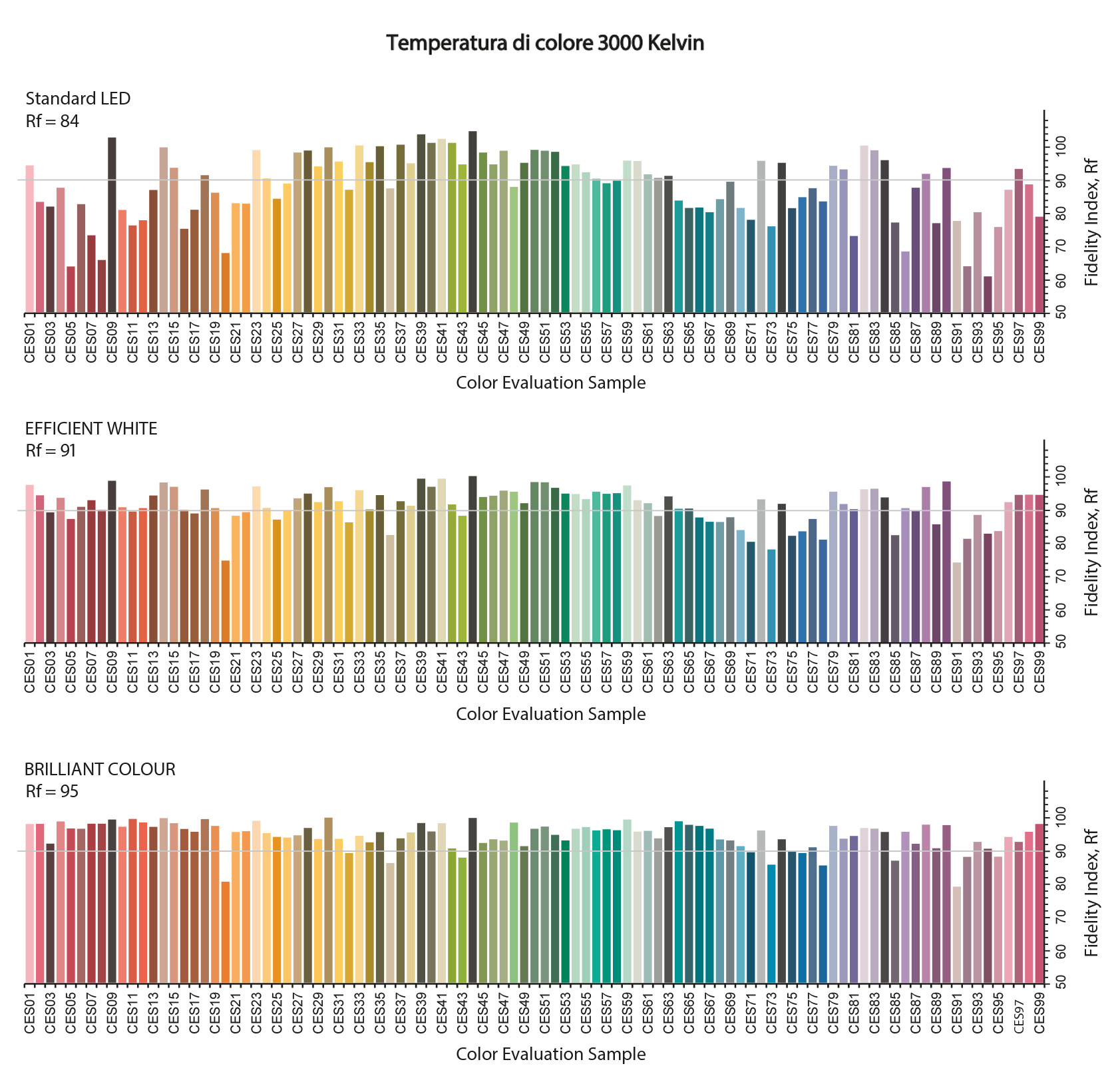
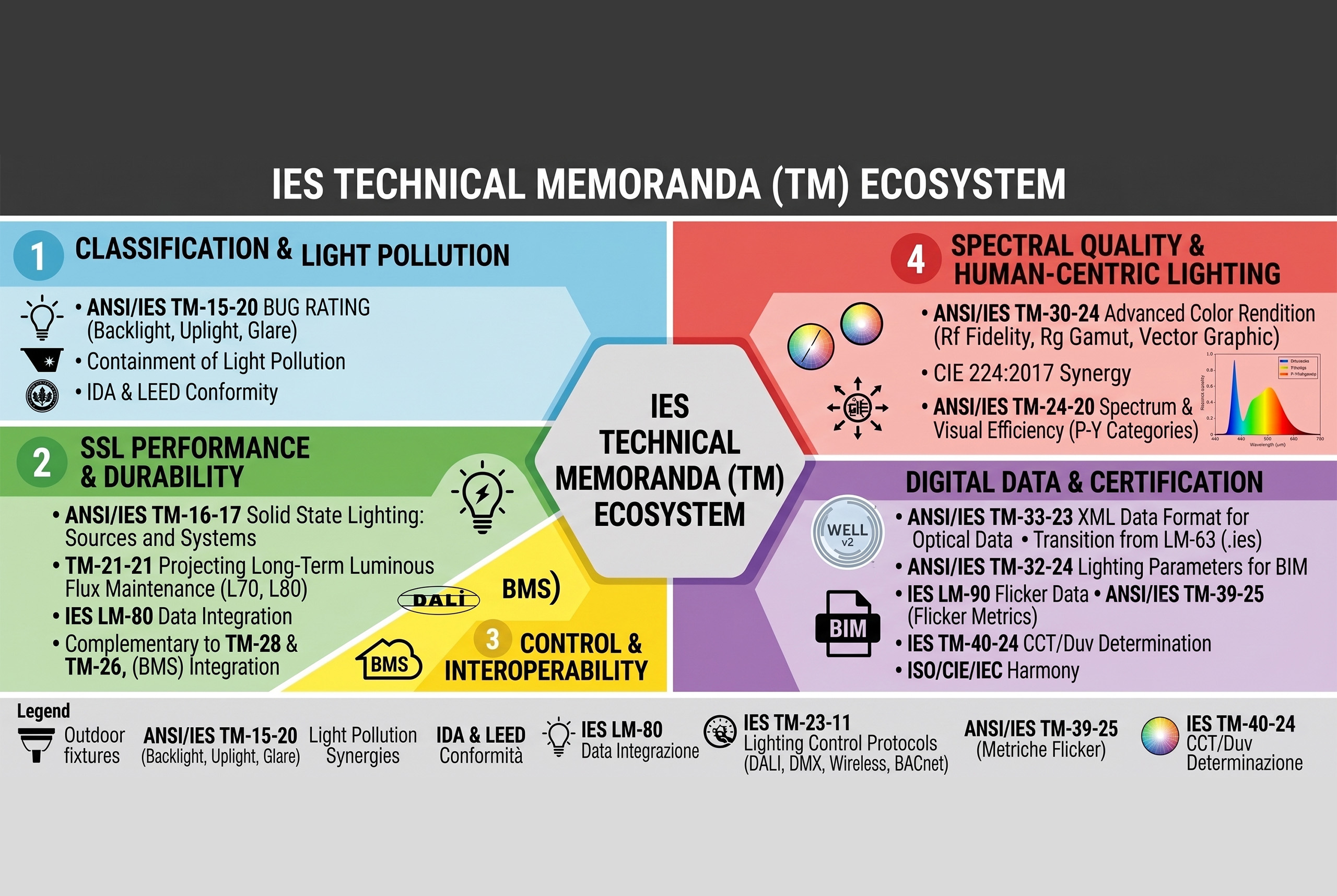
In lighting design, all this translates into concrete choices. In a museum environment, it will be a priority to optimize RF, ensuring the fidelity of the original colors. In a commercial environment, it may be preferable to emphasize Rg, to enhance specific materials, finishes and shades. The evolution of colour rendering therefore requires systemic change. Designers need to master new metrics and digital measurement technologies. On the part of manufacturers, it is necessary to develop optically refined sources, capable of responding to diversified perceptual needs. And on the part of the regulatory bodies, the adoption of updated standards, such as the ANSI/IES TM-30-20, or the WELL v2, LEED v4.1 and BREEAM protocols, is urgently needed.

Finally, the future of colour rendering is geared towards dynamic personalisation of light. Technologies such as tunable white, combined with intelligent adaptive control systems, will allow the spectrum to be modulated according to the time of day, the type of activity and individual preferences. In this scenario, color fidelity and subjective preference are no longer antagonists, but become synergistic components of an integrated design system.

Designing light, in this perspective, means overcoming the static logic of traditional indices to embrace a sensitive, flexible and perceptual experience-centered approach. What matters is not only what light is emitted, but how it is perceived, what emotions it evokes and what quality of presence it returns to the built space.

Beyond the CRI: The New Era of Colour Rendering in Architectural Light

How Rf and Rg redefine color rendering for a light designed on the visual experience

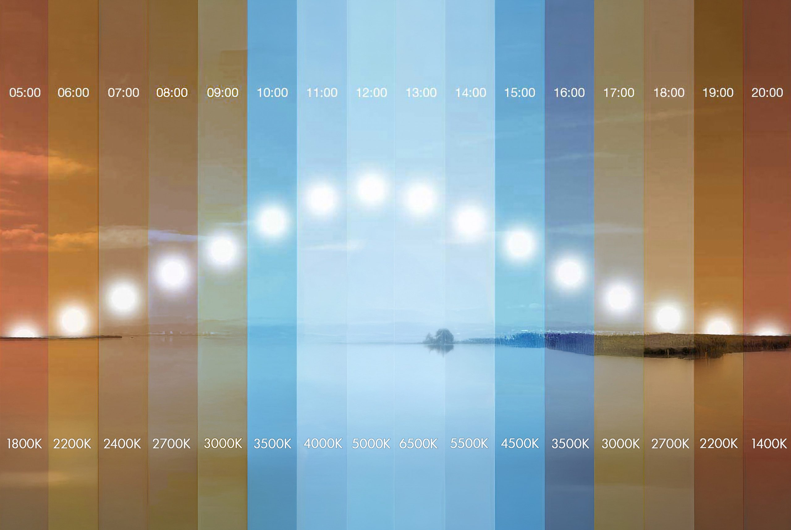
Continuing the analysis of the perceptive quality of light, it is evident that colour rendering, understood in the broadest and most up-to-date sense of the term, represents an essential dimension for conscious lighting design. If the color temperature establishes the emotional and biological tone of the light, it is the color rendering that defines the perceptual verisimilitude, or the consistency between what we see and what we expect to see in a given visual context.

The CRI (Color Rendering Index), although historically consolidated and still required by many standards (such as UNI EN 12464-1:2021 for indoor work environments), shows obvious limitations in the evaluation of modern sources, in particular LEDs with an inhomogeneous spectrum. The introduction of sources with non-continuous spectral emissions, such as those based on blue LEDs coated with phosphors, has in fact made it necessary to rethink the measuring instruments.

The Color Fidelity Index (RF), introduced by CIE 224:2017 and an integral part of the TM-30 system, represents a significant evolution. Unlike CRI, which uses 8 color samples (plus 6 optional), RF is based on 99 more spectrally representative samples from real surfaces, including human skin tones and natural materials, thus offering greater reliability in the evaluation of color fidelity.

But passing the CRI does not end with the mere numerical expansion of the test samples: it is based on a new understanding of the visual experience, in which it is not only the accuracy of the color compared to a standard that counts, but also the emotional effect, the chromatic attractiveness and the perceived vividness. For this reason, CIE 253:2024 has consolidated a new phase of research, introducing complementary perceptual metrics, which include assessments of preference, perceived saturation and naturalness.

An exemplary case is represented by the image showing a comparative sequence of red apples illuminated by sources with different CRI (78, 85, 90, 95). Progressive variation allows you to intuitively observe how the perceptual quality of the color changes  as color fidelity changes. Reds initially appear attenuated and dull (CRI 78), progressively improve (CRI 85 and 90) and achieve a consistent and natural rendering with CRI 95.

However, this same image highlights the structural limitations of the CRI. While it offers numerical data,  it does not distinguish which hues are compromised, how much saturation is altered, nor does it provide information on vibrance or color preference. The CRI quantifies an average deviation from an ideal reference, but it does not tell how light is perceived or how it affects the sensory quality of the visual experience. For this reason, the CRI must be integrated with indices such as Rf and Rg, which offer a more articulated reading of the chromatic behavior. While Rf measures color fidelity relative to an ideal reference, Rg (Color Gamut Index) describes how much the source changes the saturation of colors. An Rg of 100 indicates neutral saturation, higher values express gamut expansion (more vivid colors), and lower values indicate a desaturating effect.

In summary, Rf assesses color correctness, while Rg measures vividness and aesthetic impact. An LED can have a high Rf, but be visually flat if Rg is too low; conversely, a high Rg can enhance the colors but compromise their fidelity. The combination of both allows for a more complete and realistic assessment of colour rendering in the built space. These new metrics do not limit themselves to introducing an aesthetic judgment: they focus on the relationship between the light spectrum and the human visual system, highlighting how the perception of color is an adaptive and subjective phenomenon, influenced by the environmental context, visual memory and perceptual history of the observer.

From a physiological point of view, the eye constantly adapts through processes of retinal adaptation and cortical compensation, such as chromatic constancy and simultaneous contrast. A source that appears neutral in the laboratory may be inconsistent in environments with hot surfaces or with other sources of a different spectrum. The use of Rf and Rg must therefore be accompanied by a critical evaluation of the design context. Geometry, finishes, lighting interactions and intended use are decisive elements. Lighting design is never just an algorithmic operation, but a complex perceptual reading, which requires technical expertise, experience in the field and design sensitivity.

A further element concerns the temporal dimension of chromatic perception. The transition between sources with different yields, or between environments with inconsistent CCTs, can generate perceptual interruptions, visual discontinuity, or even disorientation. It is a crucial aspect in museums, educational spaces, healthcare or retail environments, where perceptual continuity is a fundamental requirement.

In these contexts, the lighting designer is called upon to design light as a dynamic perceptual sequence, managing not only the spatial distribution of light, but also the temporality of its variation. Colour rendering thus becomes a dynamic value, to be harmonised with the user experience and the function of the space. This vision paves the way for perceptually aware lighting systems, capable of modulating the spectrum in real time according to the user, the context and the activity. Light is no longer a static emission, but a sensitive material designed to resonate with the physiological and cognitive rhythms of man.

In lighting design, all this translates into concrete choices. In a museum environment, it will be a priority to optimize RF, ensuring the fidelity of the original colors. In a commercial environment, it may be preferable to emphasize Rg, to enhance specific materials, finishes and shades. The evolution of colour rendering therefore requires systemic change. Designers need to master new metrics and digital measurement technologies. On the part of manufacturers, it is necessary to develop optically refined sources, capable of responding to diversified perceptual needs. And on the part of the regulatory bodies, the adoption of updated standards, such as the ANSI/IES TM-30-20, or the WELL v2, LEED v4.1 and BREEAM protocols, is urgently needed.

Finally, the future of colour rendering is geared towards dynamic personalisation of light. Technologies such as tunable white, combined with intelligent adaptive control systems, will allow the spectrum to be modulated according to the time of day, the type of activity and individual preferences. In this scenario, color fidelity and subjective preference are no longer antagonists, but become synergistic components of an integrated design system.

Designing light, in this perspective, means overcoming the static logic of traditional indices to embrace a sensitive, flexible and perceptual experience-centered approach. What matters is not only what light is emitted, but how it is perceived, what emotions it evokes and what quality of presence it returns to the built space.
Other Lighting Post

Other Lighting Post

This section brings together a comprehensive body of theoretical, scientific, and design insights into the theory of light applied to lighting design, systematically addressing the complex relationship between light, visual perception, and spatial design. The content develops the physical foundations of light, an understanding of the mechanisms of human vision, the differences between photopic and melanopic illuminance, and the biological impact of artificial light, integrating advanced metrics and contemporary interpretation criteria.

The page also explores the functioning of LED sources, the spectral and perceptual implications of solid-state light, the evolution of color rendering criteria, and the growing role of light as an informational and perceptual system, capable of influencing behavior, comfort, and the quality of spatial experience.

Ample space is dedicated to the relevant regulatory and technical framework, international standards, sustainability protocols, and control systems, understood as essential tools for rigorous, measurable, and consistent design.

Overall, the section provides a vision of the theory of light as the cultural and operational basis of lighting design, in which scientific knowledge, perceptual awareness, and design method converge to guide the lighting designer in the construction of balanced, legible, and qualitatively significant spaces.

This section brings together a comprehensive body of theoretical, scientific, and design insights into the theory of light applied to lighting design, systematically addressing the complex relationship between light, visual perception, and spatial design. The content develops the physical foundations of light, an understanding of the mechanisms of human vision, the differences between photopic and melanopic illuminance, and the biological impact of artificial light, integrating advanced metrics and contemporary interpretation criteria.

The page also explores the functioning of LED sources, the spectral and perceptual implications of solid-state light, the evolution of color rendering criteria, and the growing role of light as an informational and perceptual system, capable of influencing behavior, comfort, and the quality of spatial experience.

Ample space is dedicated to the relevant regulatory and technical framework, international standards, sustainability protocols, and control systems, understood as essential tools for rigorous, measurable, and consistent design.

Overall, the section provides a vision of the theory of light as the cultural and operational basis of lighting design, in which scientific knowledge, perceptual awareness, and design method converge to guide the lighting designer in the construction of balanced, legible, and qualitatively significant spaces.

Dalla-Percezione-alla-Funzione-L’Influenza-della-Temperatura-di-Colore-sullo-Spazio-Illuminato-copertina
From Perception to Function: The Influence of Color Temperature on Illuminated Space Color temperature as a perceptual language: designing atmospheres, guiding vision and shaping space After exploring the scientific bases,…
La-luce-che-informa-rivoluzione-o-rischio-per-il-futuro-dell’illuminazione-copertina-eng
The Light That Informs: Revolution or Risk for the Future of Lighting? μPLS and microLED between innovation and danger of visual excess Historically, we are used to thinking of artificial…
Differences Between Traditional LEDs and μPLS by Nichia: From the Car to the City, the Path of the Digital Light Engine From road safety to smart city: μPLS and high-resolution…
The Silent Revolution of LEDs: The Crisis of Seeing in the Age of Solid-State Lighting From Daylight to Electrical Simulation, Digital Lighting Redefines Perception, Dissolving the Link Between Visual Experience…
Technical Regulations for Electrical Systems and Lighting in Yachts Electrical safety, visual comfort and ship compliance according to IEC, ISO, CEI, RINA and DNV standards. Electrical Safety and Wiring in…
Main Regulatory Bodies and Guidelines in Lighting Technology A comprehensive framework on technical standards, international collaborations and key documents for designing light according to scientific and performance criteria. CIE (International…
Standard-Lighting-Measurements-(LM)-dell’IES-Codici,-Struttura-e-Implicazioni-Progettuali_Copertina-eng
IES Standard Lighting Measurements (LM): Codes, Structure, and Design Implications Technical guide to LM standards for measuring the photometric, chromatic, and electrical performance of LEDs, modules, and luminaires. After having…
Standard-Technical-Memoranda-(TM)-dell’IES-Codici,-Struttura-e-Implicazioni-Progettuali_Copertina-eng
IES Standard Technical Memoranda (TM): Codes, Structure, and Design Implications A technical guide to the use and interpretation of TM documents in lighting design The following insight is dedicated to…
Authoritative Standards and Guidelines in Lighting Technology: Multilevel Structure and Design Applications A complex regulatory system for designing light with technical rigor and application coherence The evolution of light sources…
With the advent of LED sources, can we define the 1931 CIE diagram as obsolete? Formally no, but practically yes, in many application contexts. Now that we have understood how…
digital light and perceived thresholds - cover
Digital Lighting and Visual Perception: the Dissolution of the See/Understand Relationship How electric light is changing the relationship between seeing, experiencing, and understanding the world In today's era of digital…
Electroluminescence Process in LED Semiconductor Devices
How LEDs Work: Electroluminescence, Materials, and the Light Spectrum From semiconductor structure to color rendering: how LED light takes shape Visible light, although perceived as a continuous and unified phenomenon,…
Fundamental Properties of Electromagnetic-Waves Amplitude and Wavelength
Visible Light and the Electromagnetic Spectrum: Physical Principles for Lighting Design How wavelengths influence perception, color, and light design After examining how the human eye adapts to different illumination levels…
Visual Signal Transmission Pathway in the Human Retina
Photopic vs Melanopic Illuminance: Definition and Spectral Sensitivity MEDI, EML, and CS. Three essential indicators for measuring the circadian impact of artificial light The perception of light varies according to…
Light Perception Human Eye Capabilities and Limitations
Light Perception: Capabilities and Limits of the Human Eye Understanding how the human eye works is the first step toward designing light with awareness  The human eye is a highly…
Lighting-Design-e-Teoria-della-Luce
Lighting Design and Light Theory Complexity in the relationship between light, perception, and design   How does a lighting designer develop a lighting project? Which disciplines should a rigorous lighting…
MENU